Saltmarrow
Brand identity for a tinned-seafood range
Ours, not a client's. Saltmarrow was designed here start to finish, which is why the whole process is visible: no commissioned work can be shown this completely before the brand that paid for it has launched.
Frame 1 of 30
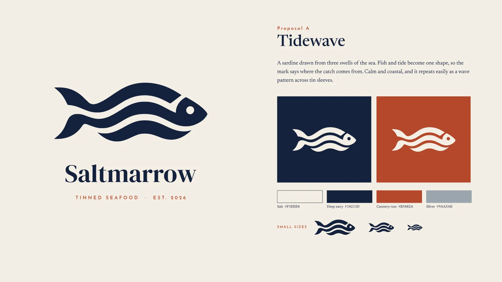
Route A — Tidewave
Identity frame
A sardine drawn from three swells of the sea: the waves are its scales, its tail and its motion. All three routes are presented identically — reversed on navy and on rust, the four colours, the mark at three small sizes — so they are judged against each other rather than against three different presentations.
How we build these →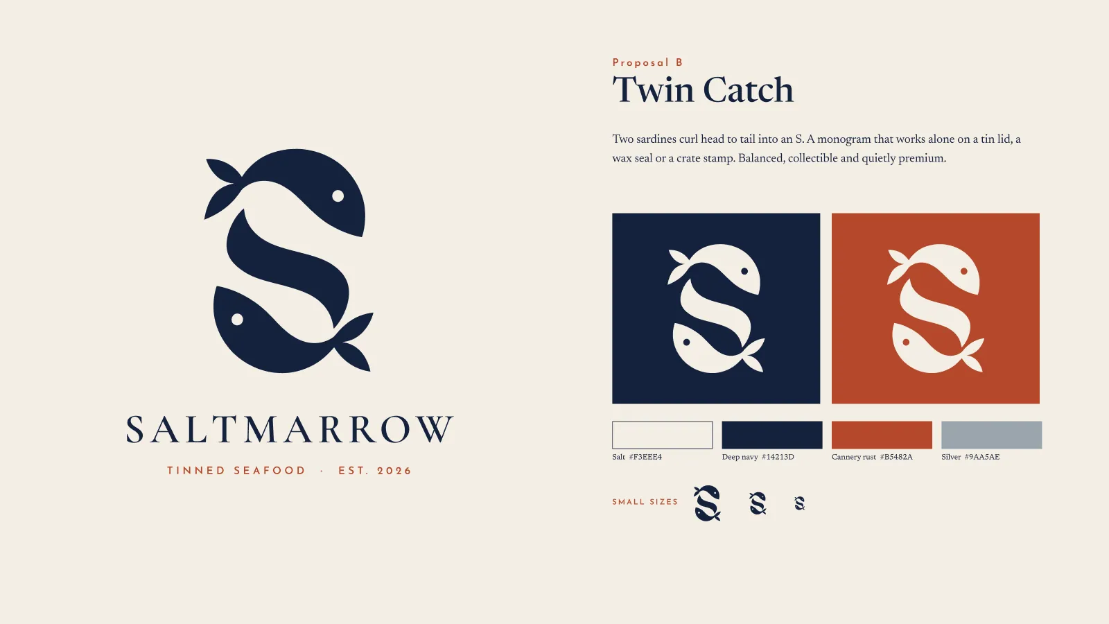
Frame 2 of 30
Route B — Twin Catch
Identity frame
Two sardines curled head to tail into an S. A monogram holds on a tin lid, a wax seal and a crate stamp where a wide lockup cannot, which is the case this route was drawn to make.
How we build these →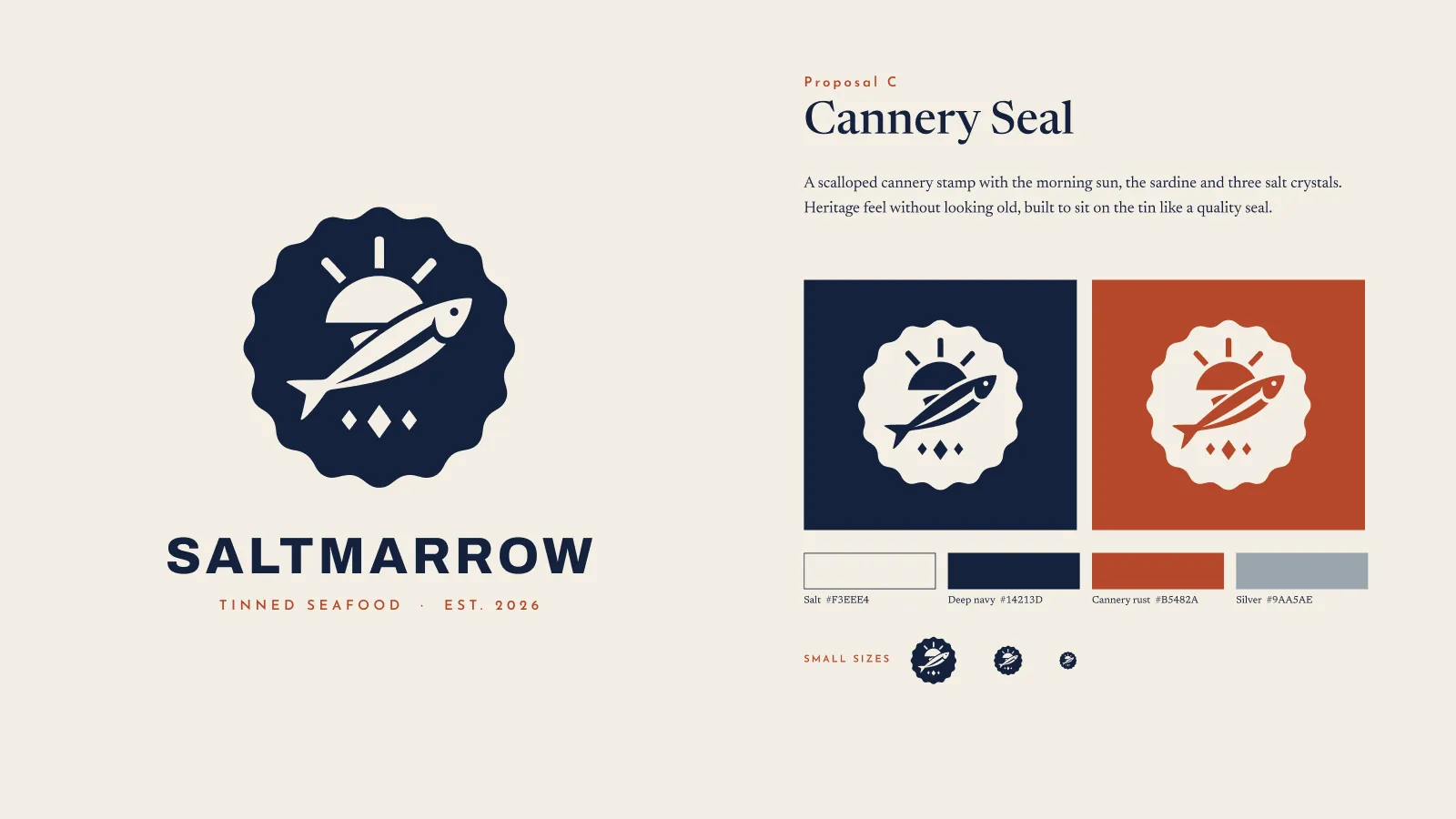
Frame 3 of 30
Route C — Cannery Seal
Identity frame
A scalloped cannery stamp carrying the morning sun, the sardine and three salt crystals. The heritage route holds the most detail of the three, and the row of small sizes along the bottom is where that stops being an advantage.
How we build these →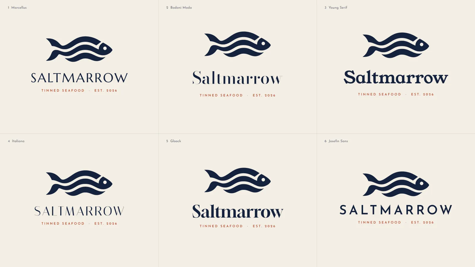
Frame 4 of 30
Six wordmarks, one mark
Identity frame
The chosen mark set with Marcellus, Bodoni Moda, Young Serif, Italiana, Gloock and Josefin Sans, all at one size on one board. Typefaces compared a screen at a time get chosen by whichever was seen last. Josefin Sans took it.
How we build these →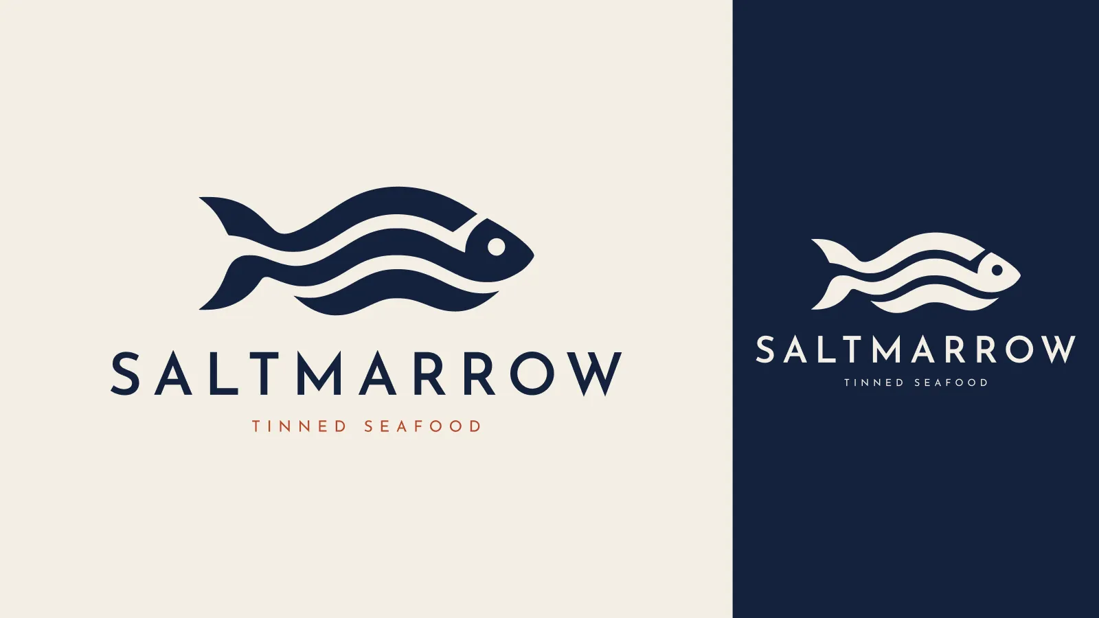
Frame 5 of 30
The lockup, both ways round
Identity frame
Navy on salt and salt on navy at the same size, on one board. Every application after this is placed from this file rather than re-assembled by eye, which is the whole reason a lockup is locked before anything else is drawn.
How we build these →
Frame 6 of 30
Title
Identity frame
The lockup reversed out of deep navy, full bleed, with nothing else on the board. The explaining happens two frames later, by which point the reader has already formed a first impression nobody argued them into.
How we build these →
Frame 7 of 30
The mark on its own
Identity frame
Navy on salt, filling the frame, with no wordmark to lean on. The tin lid, the wax seal and the avatar all take the mark alone, so it is shown alone before it is shown in company.
How we build these →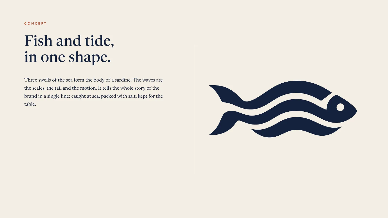
Frame 8 of 30
Fish and tide, in one shape
Identity frame
Three sentences beside the mark: the swells are the scales, the tail and the motion, and the brand's whole story is caught at sea, packed with salt, kept for the table. A mark nobody can explain in a line gets quietly redrawn by the next designer who touches it.
How we build these →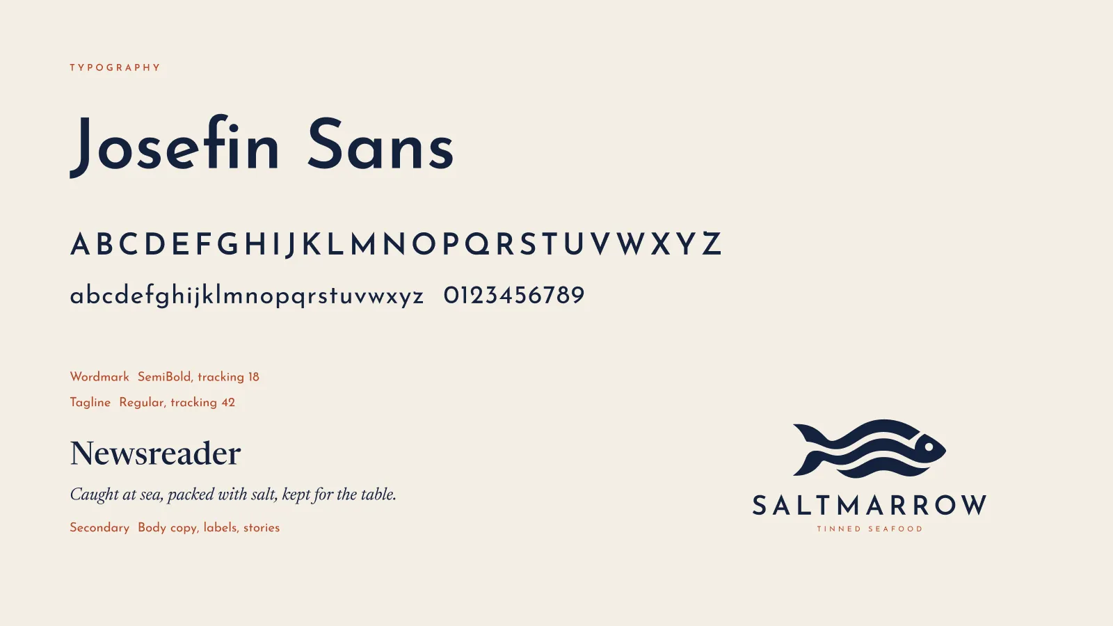
Frame 9 of 30
Two typefaces, with the numbers
Identity frame
Josefin Sans for the wordmark at SemiBold, tracking 18, and the tagline at tracking 42; Newsreader underneath for anything that has to be read. The tracking values are on the board because a wordmark re-typed without them is a different wordmark.
How we build these →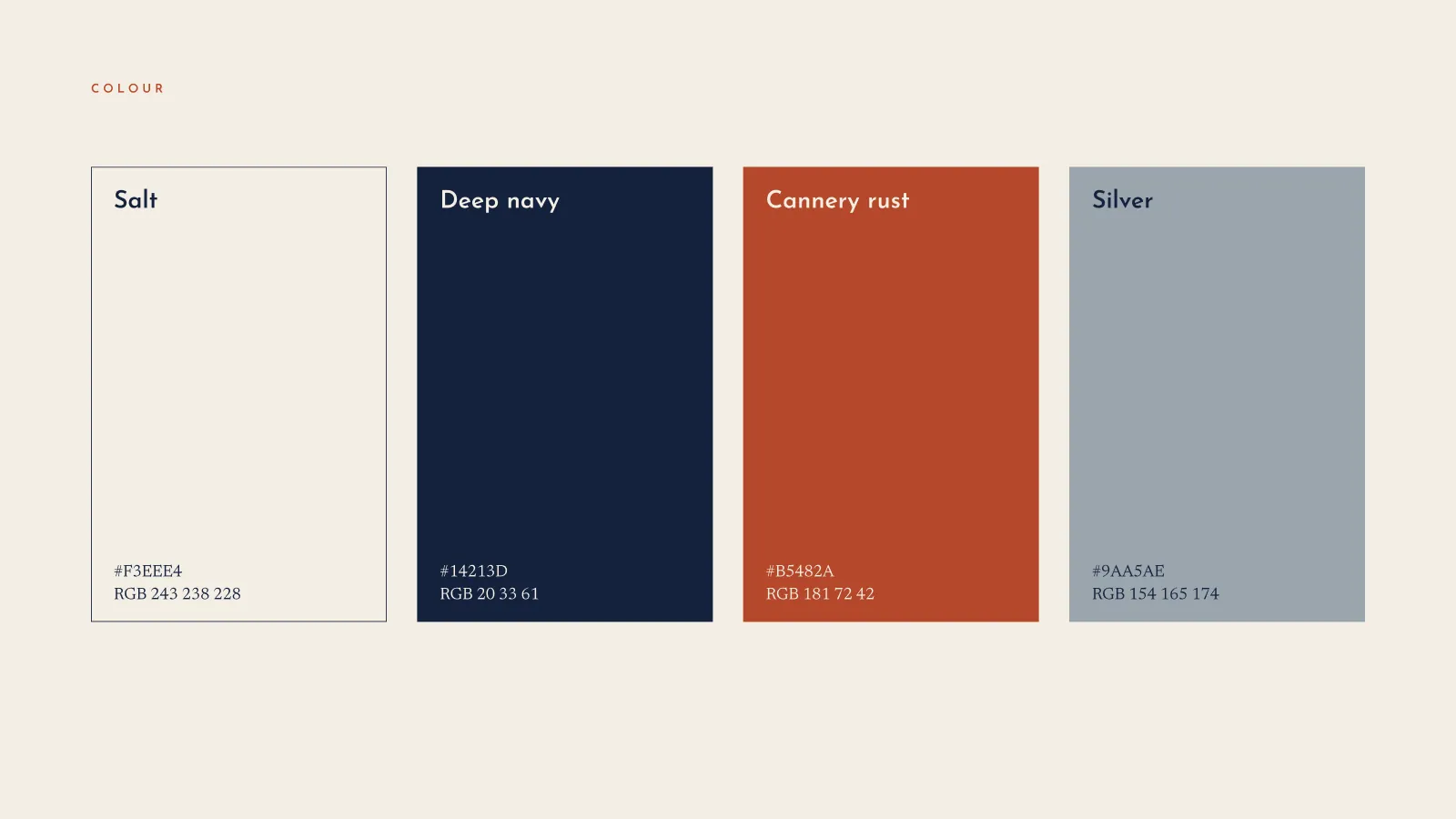
Frame 10 of 30
Four colours
Identity frame
Salt, deep navy, cannery rust and silver as full-height panels with HEX and RGB under each. Four is the entire palette: a fifth colour is how a shelf of tins stops reading as one brand.
How we build these →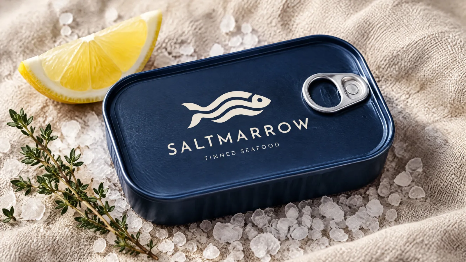
Frame 11 of 30
The tin
Identity frame
The lockup on a navy sardine tin with the ring pull, laid on coarse salt and linen with lemon and thyme. This is the object the brand exists for, so it comes first among the applications rather than last.
How we build these →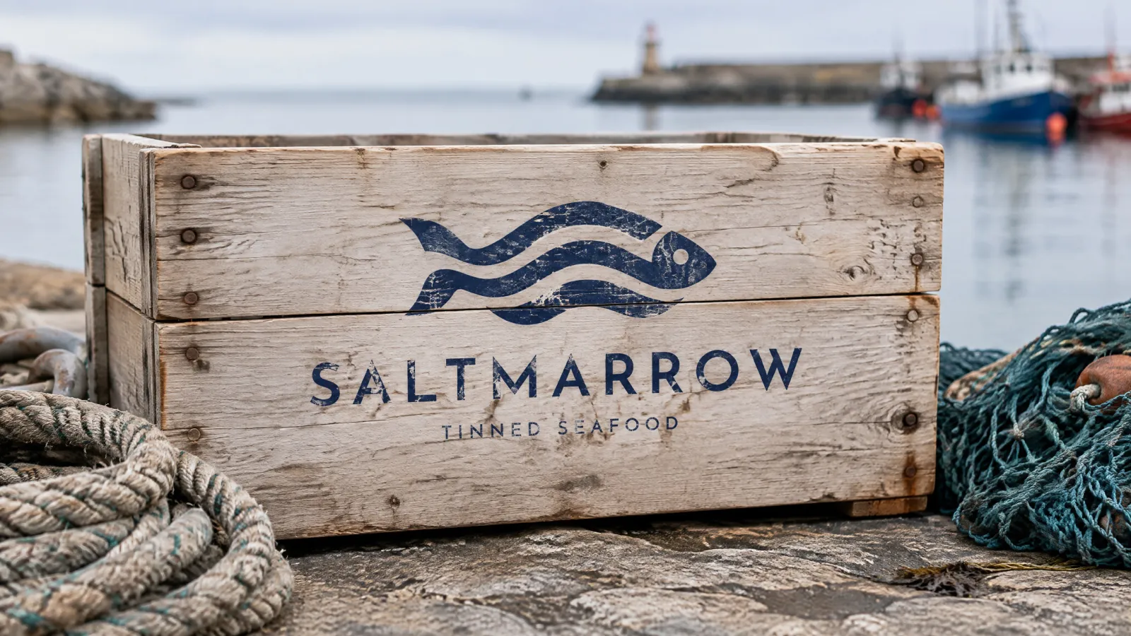
Frame 12 of 30
The crate
Identity frame
The lockup stencilled onto a wooden fish crate on the quay, the ink breaking up on the grain. A mark that has only ever been seen clean has not been tested; this is the frame that asks what happens when the printing is rough.
How we build these →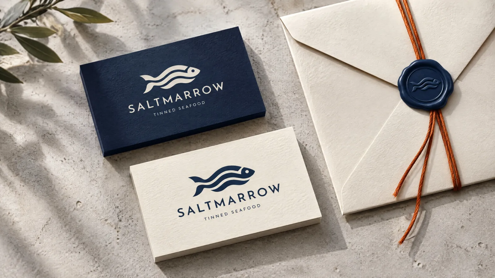
Frame 13 of 30
Stationery and the wax seal
Identity frame
Cards in both colourways and an envelope closed with a navy seal struck from the mark. Wax takes no second colour and no fine detail, so the seal is the strongest argument for a mark that works as a single silhouette.
How we build these →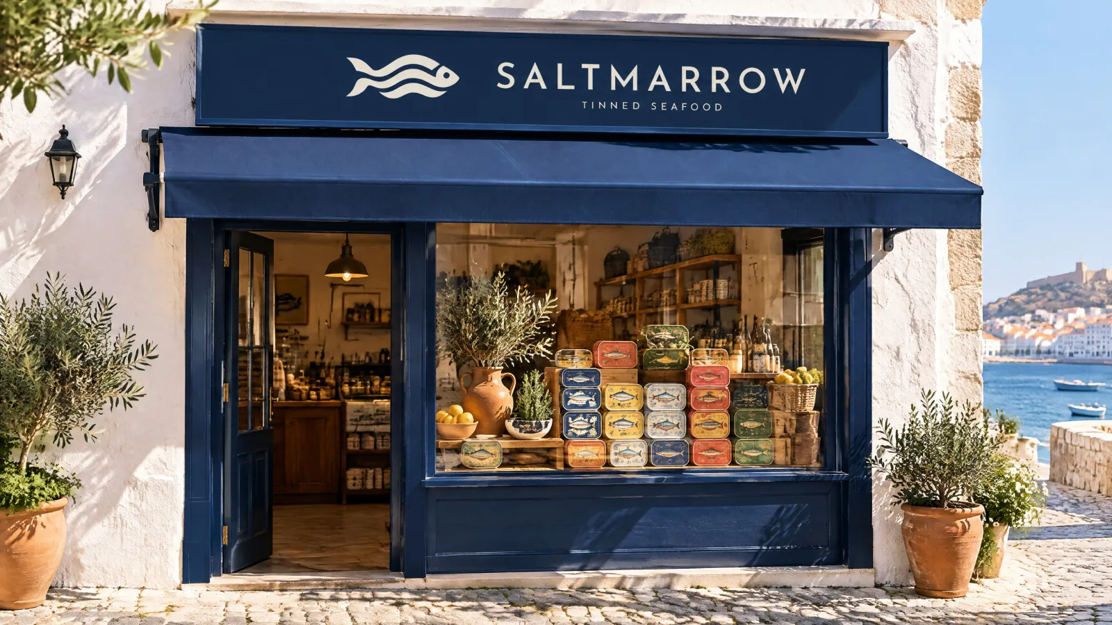
Frame 14 of 30
The shopfront
Identity frame
Navy fascia and awning over a window of tins. Distance and a glance are the last test any mark has to pass, and no close-up mockup can answer it.
How we build these →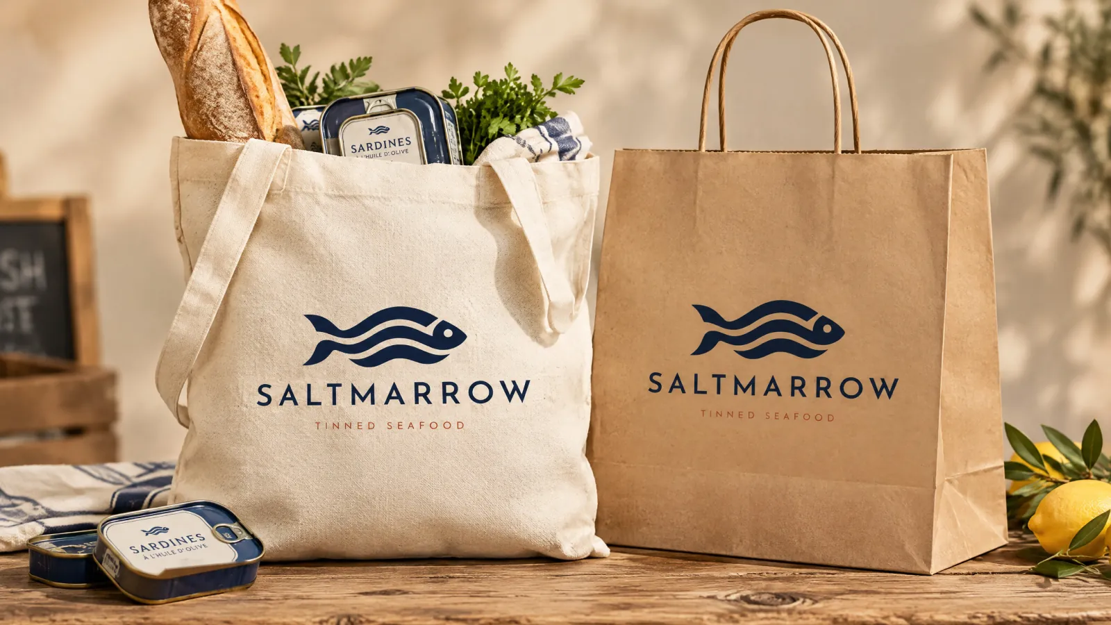
Frame 15 of 30
Tote and carrier
Identity frame
Both bags take the navy lockup with the rust tagline. The salt colourway has nothing to sit on once the ground is unbleached cotton or brown kraft, which is a rule discovered by mocking it up rather than by writing it down.
How we build these →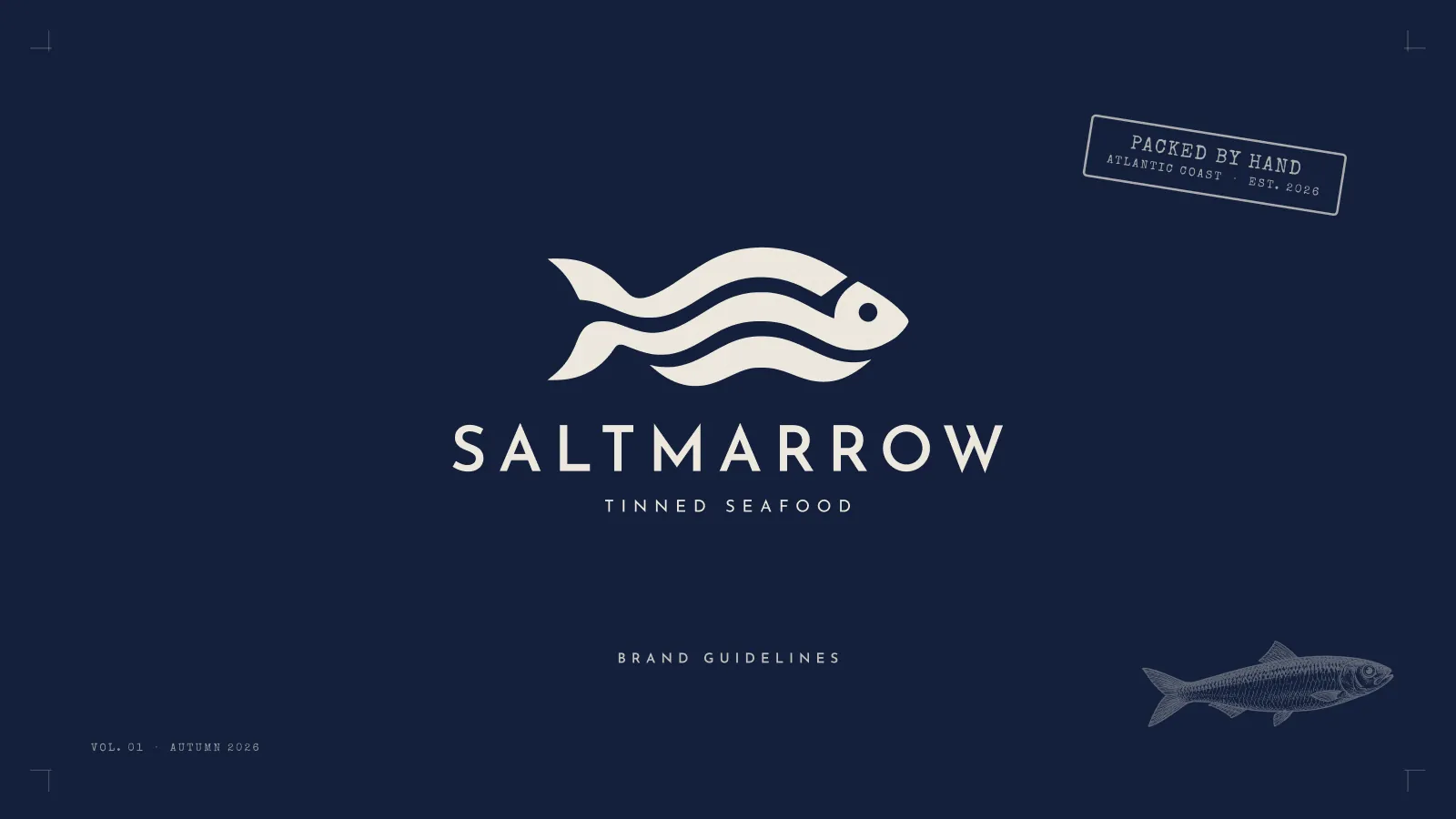
Frame 16 of 30
The cover
Identity frame
Mark and wordmark in salt on navy, a PACKED BY HAND stamp in one corner, the volume and the season at the foot. A guidelines file gets opened by people who did not commission it, so the cover answers which brand and which edition before anyone has to ask.
How we build these →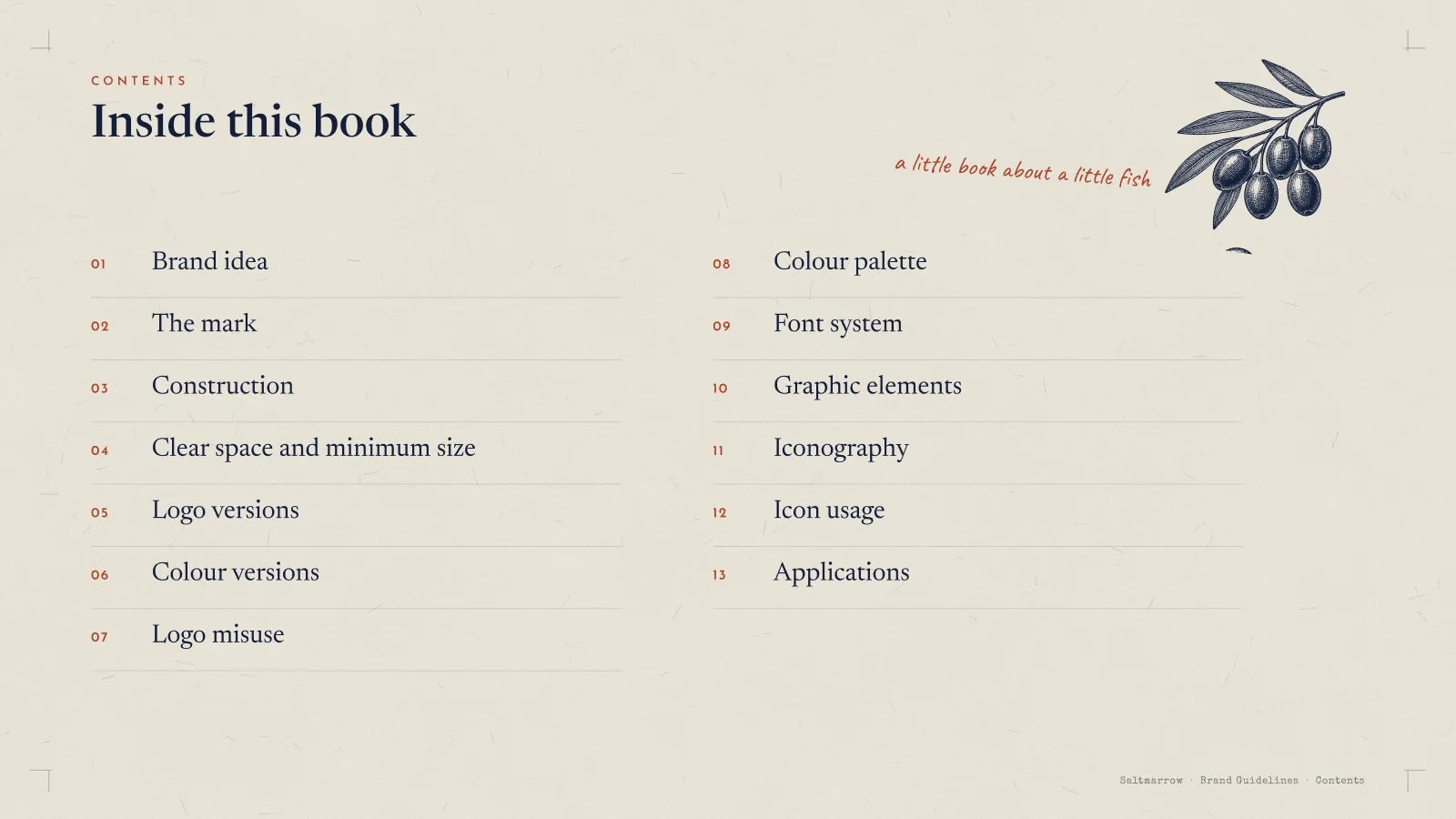
Frame 17 of 30
Contents
Identity frame
Thirteen chapters on one page, with a note in the margin: a little book about a little fish. A contents page is also a scope — it tells a client exactly what they are getting before they read a word of it.
How we build these →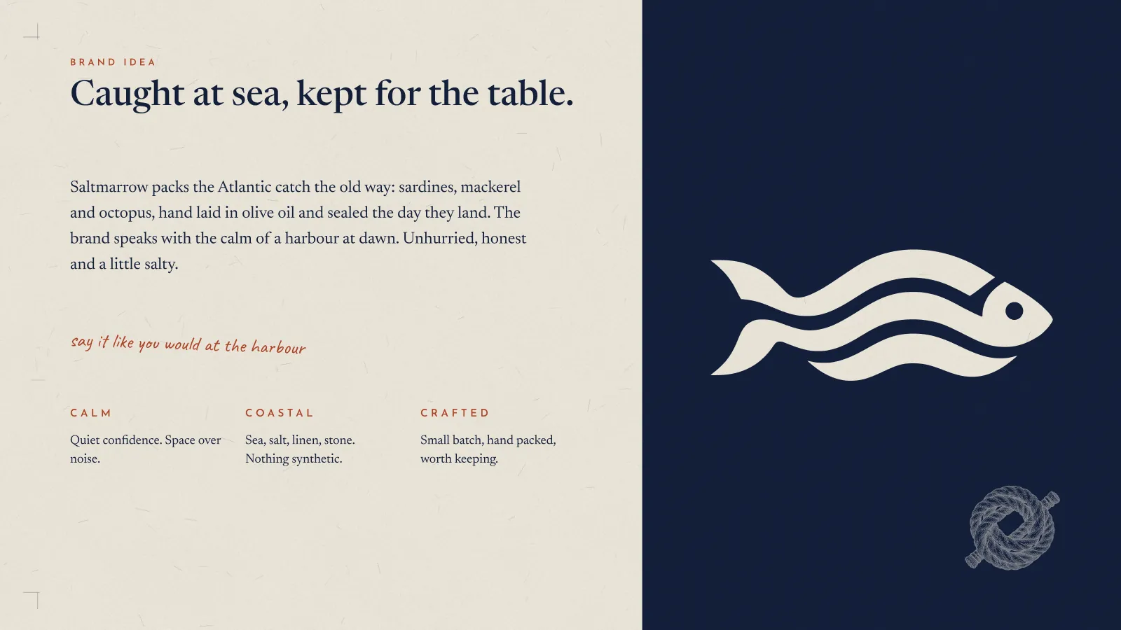
Frame 18 of 30
The brand idea
Identity frame
Caught at sea, kept for the table, then three words doing the work: calm, coastal, crafted. Each one carries a line saying what it rules out, because an adjective with nothing under it is ignored by everybody who has to use it.
How we build these →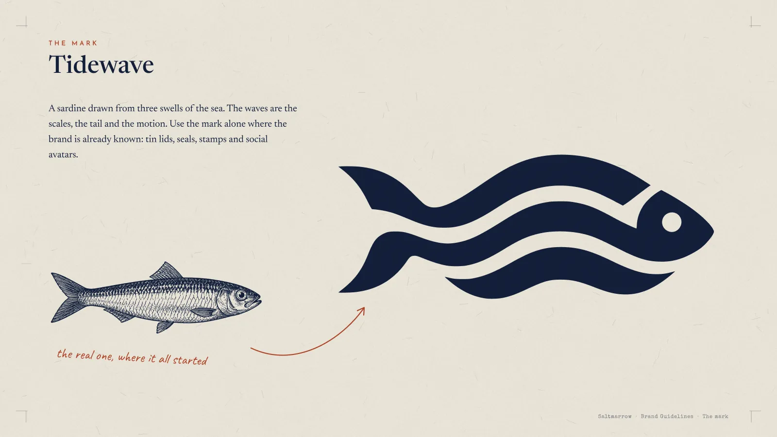
Frame 19 of 30
The mark, beside the real thing
Identity frame
The drawing next to an engraving of an actual sardine, with the margin note the real one, where it all started. Putting the source beside the abstraction settles any argument about whether the mark still reads as a fish.
How we build these →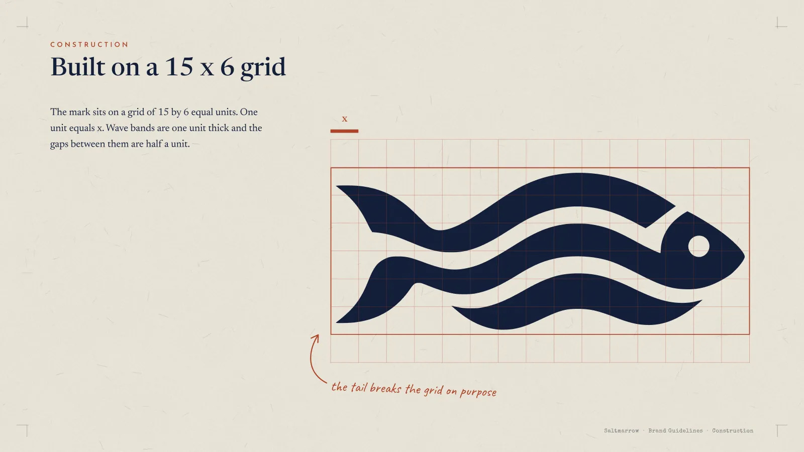
Frame 20 of 30
Built on a 15 × 6 grid
Identity frame
One unit is x, the wave bands are one unit thick and the gaps between them half a unit — and a note in the margin admits the tail breaks the grid on purpose. A construction page that hides its one exception is a page the next designer stops trusting.
How we build these →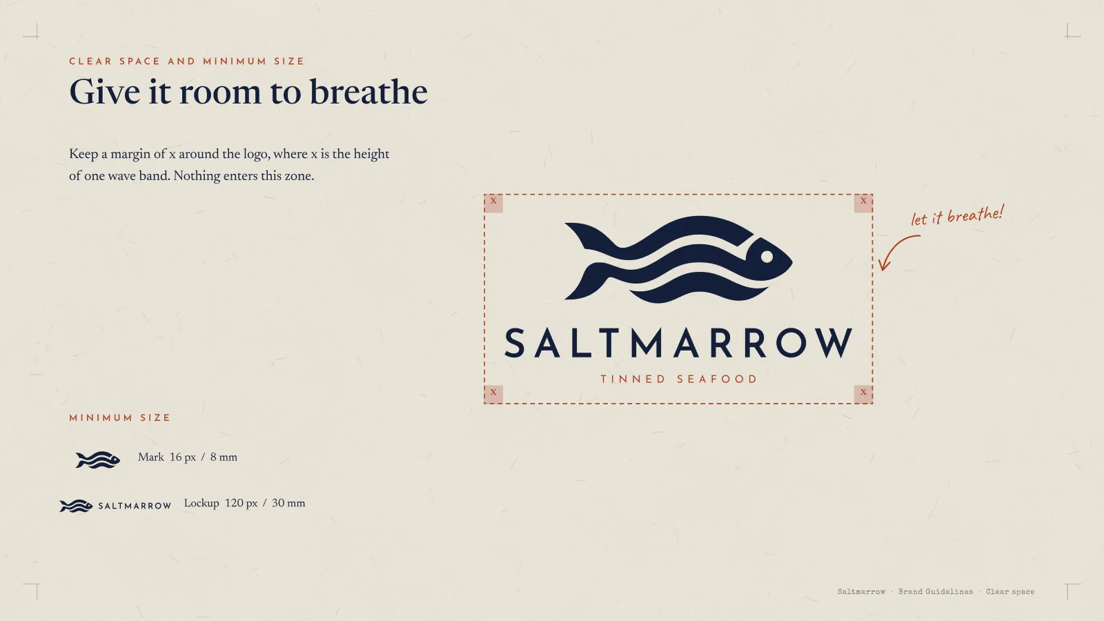
Frame 21 of 30
Clear space and minimum size
Identity frame
The clear zone is defined as x, the height of one wave band, so the rule scales with the logo instead of being a measurement that breaks at another size. Minimums are given for screen and print, separately for the mark and the lockup.
How we build these →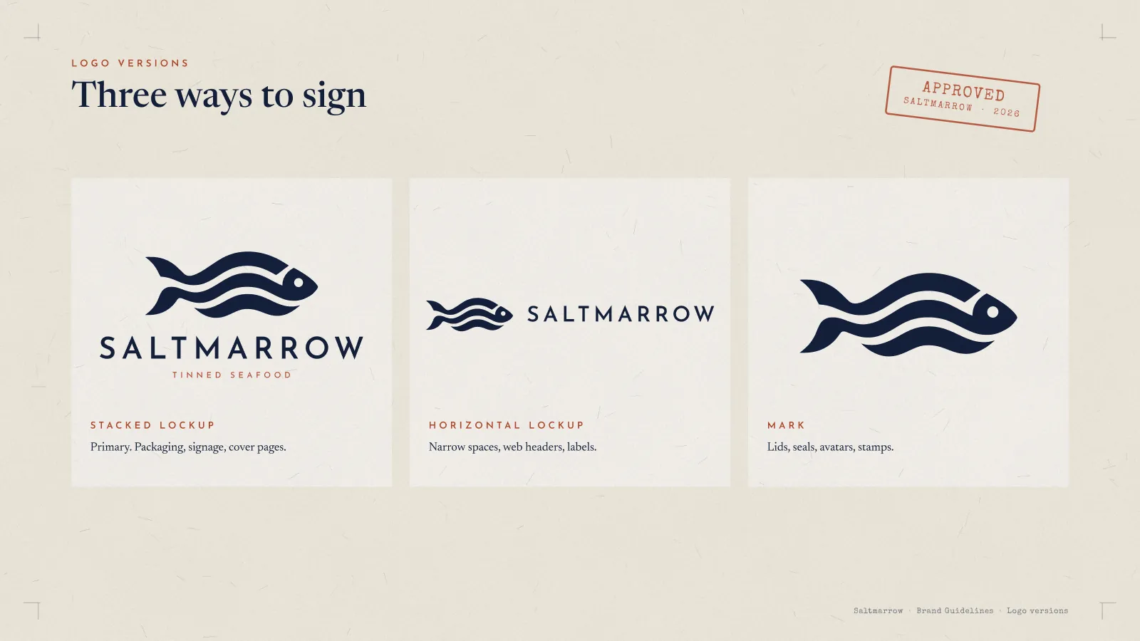
Frame 22 of 30
Three ways to sign
Identity frame
Stacked, horizontal and the mark alone, each with the job it is for written underneath. Every lockup that exists is on this page, which is how a fourth one stops getting invented in a hurry.
How we build these →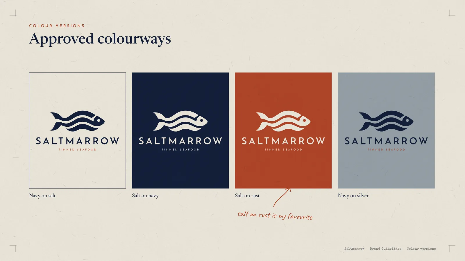
Frame 23 of 30
Approved colourways
Identity frame
Navy on salt, salt on navy, salt on rust, navy on silver, and nothing else. A rule written as a list of what is allowed can be checked; the same rule written as a principle gets argued with.
How we build these →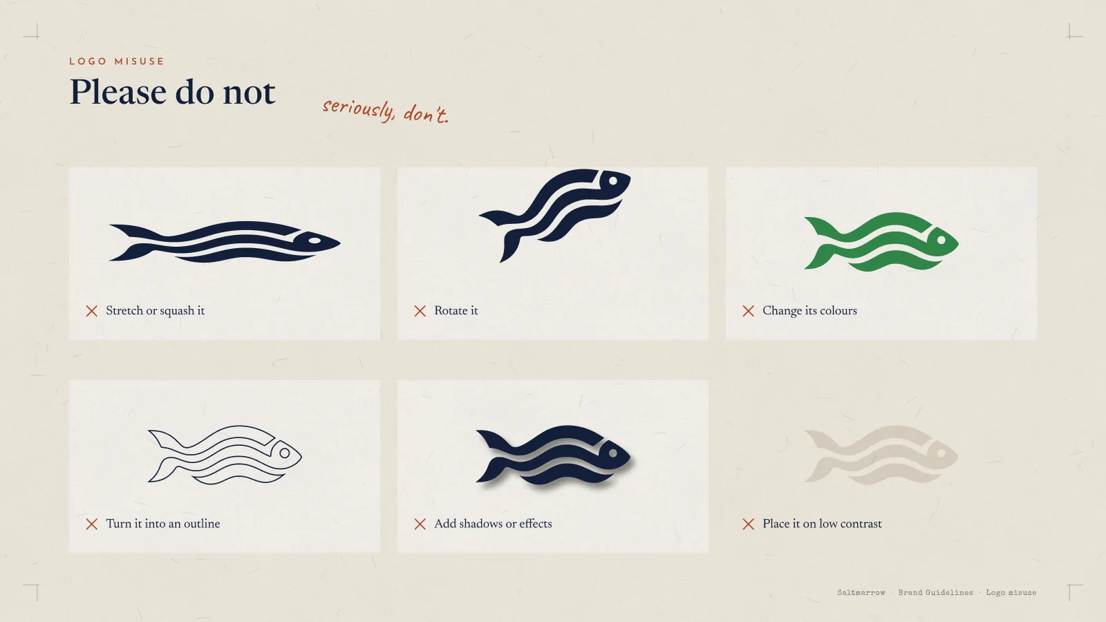
Frame 24 of 30
Logo misuse
Identity frame
Six wrong versions drawn rather than described: stretched, rotated, recoloured, outlined, shadowed, and dropped on low contrast. Nobody recognises a mistake from a sentence, and the margin adds: seriously, don't.
How we build these →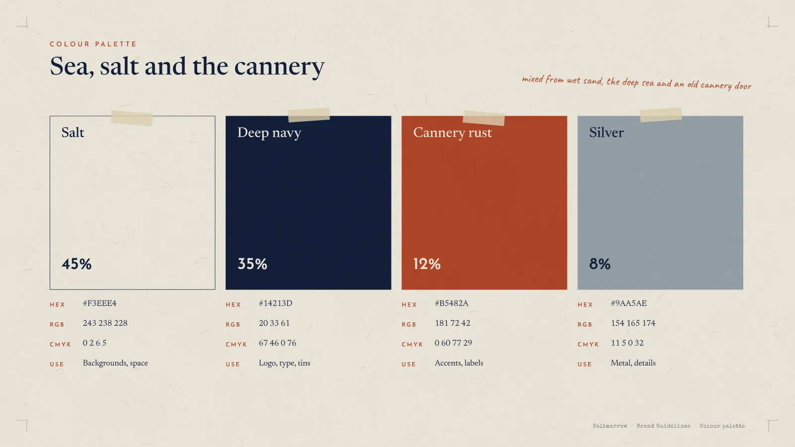
Frame 25 of 30
Colour, with values and shares
Identity frame
The four colours as taped swatches with HEX, RGB, CMYK, the job each does, and the share of a page it should hold — 45, 35, 12 and 8 per cent. The percentages are the part that keeps an accent an accent.
How we build these →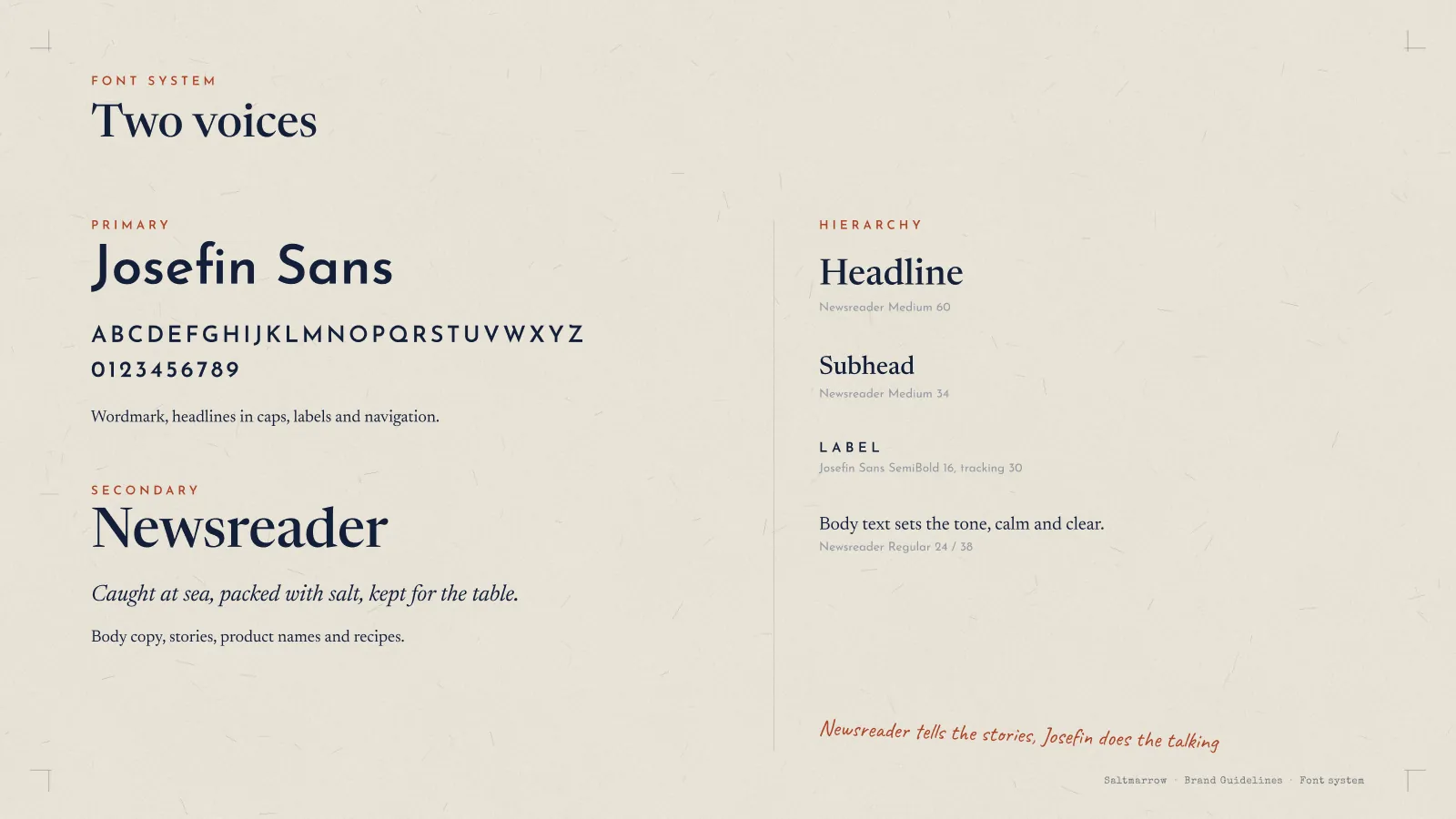
Frame 26 of 30
Two voices
Identity frame
Josefin Sans for the wordmark, caps headlines and labels; Newsreader for everything that gets read. The hierarchy column gives size and leading for each level, so the system can be rebuilt by somebody who was not in the room.
How we build these →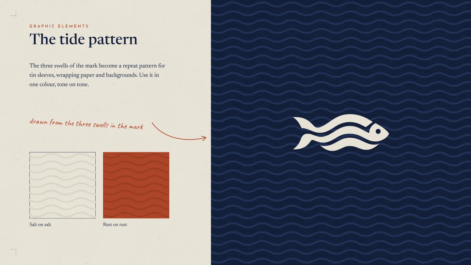
Frame 27 of 30
The tide pattern
Identity frame
The three swells of the mark opened out into a repeat for tin sleeves and wrapping, shown tone on tone in salt and in rust, then full bleed in navy. A pattern derived from the mark gives the brand a second recognisable asset without drawing anything new.
How we build these →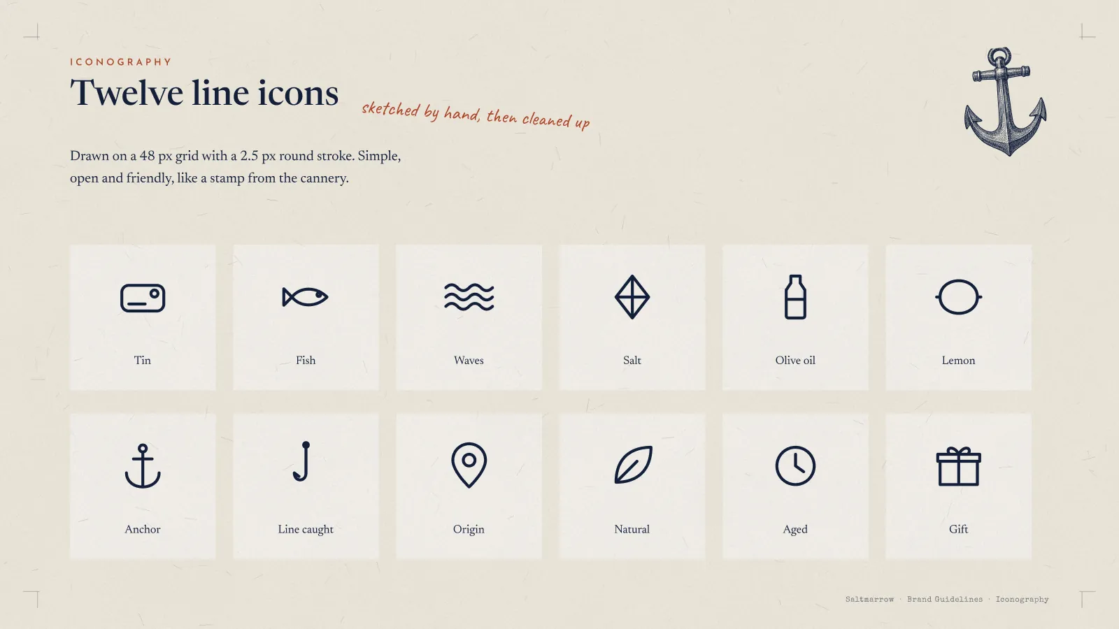
Frame 28 of 30
Twelve line icons
Identity frame
Tin, fish, waves, salt, olive oil, lemon, anchor, line caught, origin, natural, aged and gift, on a 48 px grid with a 2.5 px round stroke. One stroke weight across the set is what makes twelve separate drawings read as one family.
How we build these →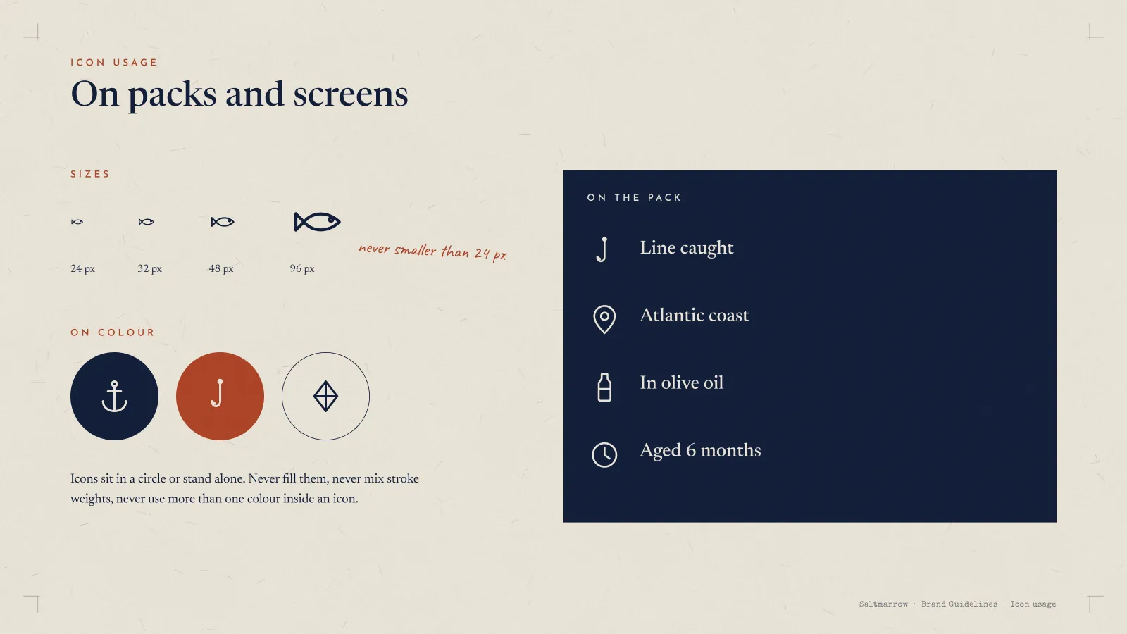
Frame 29 of 30
Icon usage
Identity frame
Sizes from 24 to 96 px with a floor noted in the margin, the icons in a circle and standing alone, and the four claims they carry on the pack. Icons are where a careful brand usually leaks, because they get drawn last and often by somebody else.
How we build these →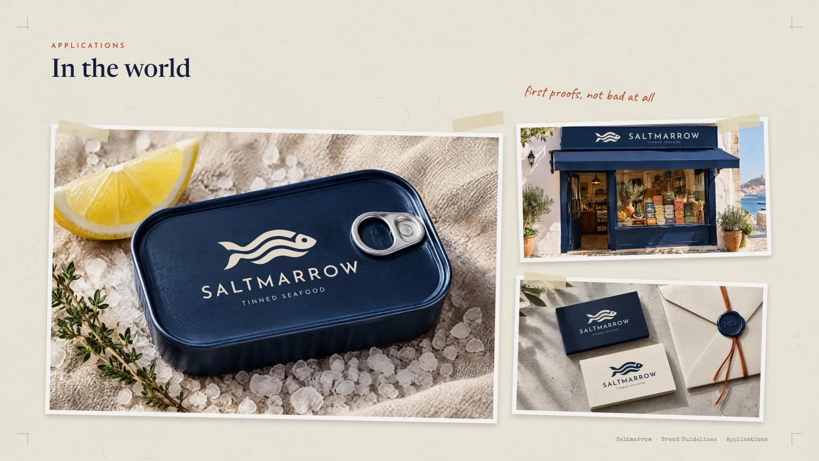
Frame 30 of 30
In the world
Identity frame
The tin, the shopfront and the stationery taped down as proofs on the closing spread, with first proofs, not bad at all written beside them. The book ends on the thing itself rather than on one more rule.
How we build these →