Dynamith
Brand identity for a hot sauce range
Ours, not a client's. Dynamith was designed here start to finish, which is why the whole process is visible: no commissioned work can be shown this completely before the brand that paid for it has launched.
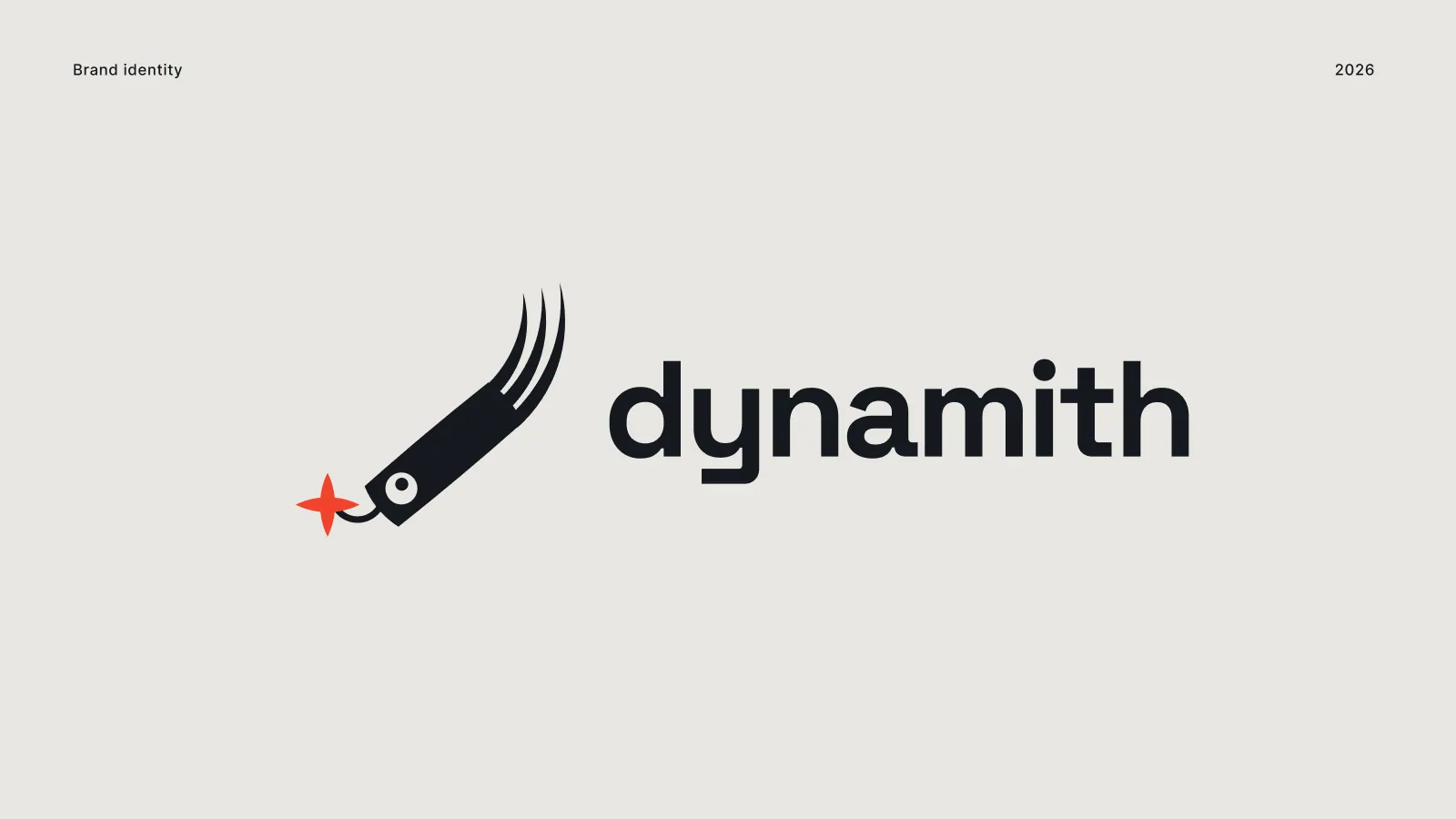
Frame 1 of 30
The lockup
Identity frame
Mark and wordmark locked at one ratio on bone. Every other application in this set is placed from this file rather than re-assembled by eye, which is the entire reason a lockup is drawn before anything else.
How we build these →
Frame 2 of 30
The mark on its own
Identity frame
Reversed out of near-black, filling the frame. A mark that only works beside its wordmark is half a mark, so this is the frame that decides whether the thing is finished.
How we build these →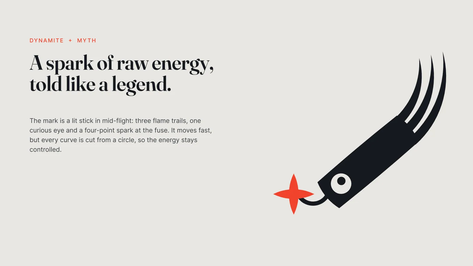
Frame 3 of 30
Where it came from
Identity frame
Dynamite and myth, stated in two lines beside the mark: a lit stick in mid-flight, three flame trails, one curious eye, a four-point spark at the fuse. A mark nobody can explain gets quietly redrawn by the next designer who touches it.
How we build these →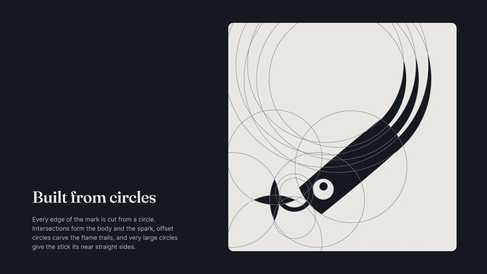
Frame 4 of 30
Built from circles
Identity frame
The construction shown rather than claimed. Intersecting circles form the body and the spark, offset circles carve the flame trails, and very large ones give the stick its nearly straight sides. Curves drawn by eye stop agreeing with each other at small sizes.
How we build these →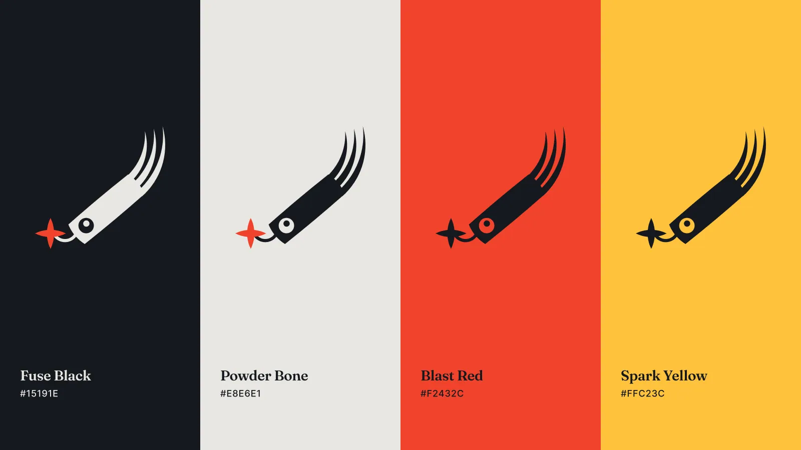
Frame 5 of 30
Four colours, each carrying the mark
Identity frame
Fuse Black, Powder Bone, Blast Red and Spark Yellow as full-height bands, each with the logo on it rather than as a bare swatch. A palette proves nothing until you see what the mark does standing on it.
How we build these →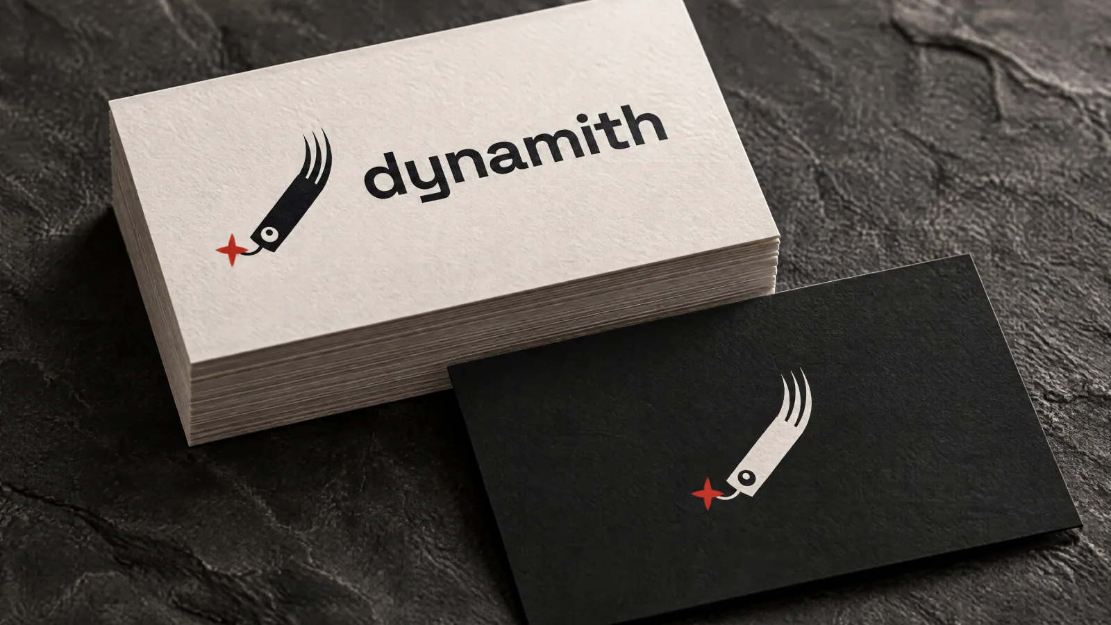
Frame 6 of 30
Business cards
Identity frame
Both grounds in one shot on stone. The pale card takes the full lockup and the dark one takes the mark alone, which is the first real test of the rule set two frames earlier.
How we build these →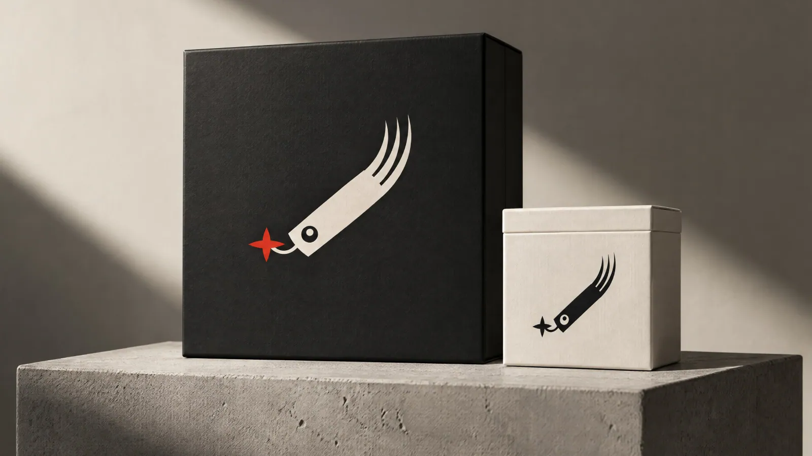
Frame 7 of 30
Packaging
Identity frame
A large black box and a small bone one, lit hard from the side. The mark swaps colour and keeps its position and its angle, so the two read as one family at a glance on a shelf.
How we build these →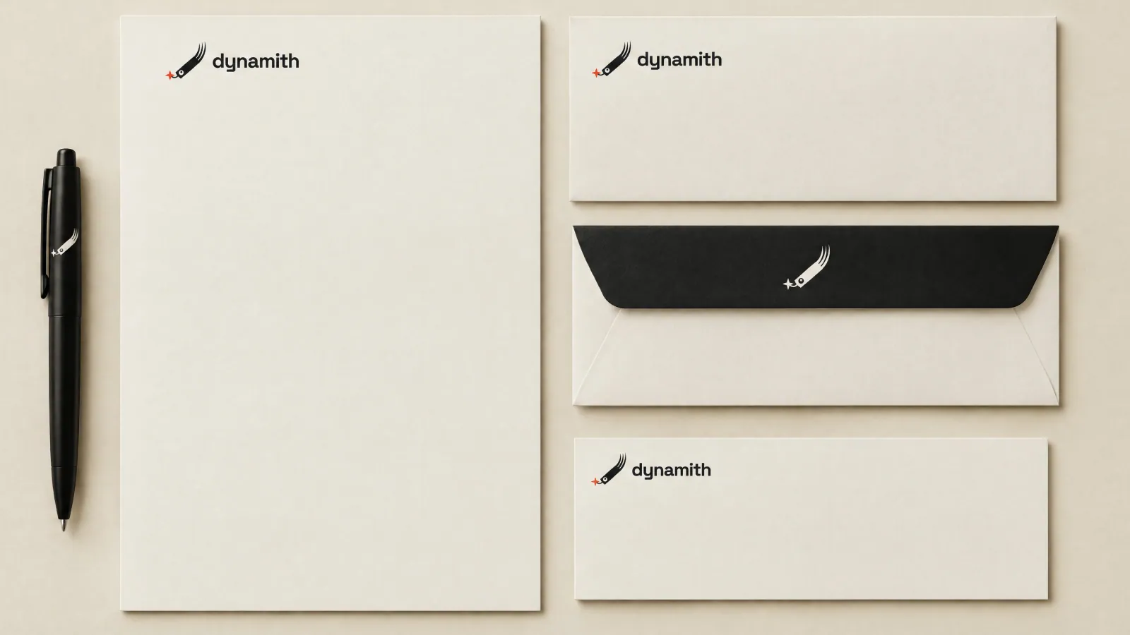
Frame 8 of 30
Stationery
Identity frame
Letterhead, compliment slip and envelope, front and flap. Small-size behaviour is settled here: the wordmark is allowed to shrink, the spark is not allowed to disappear.
How we build these →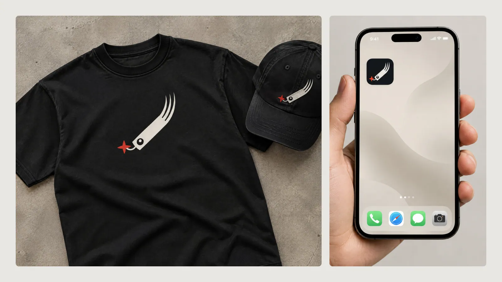
Frame 9 of 30
Apparel and the app icon
Identity frame
A tee and a cap, and the mark cropped into a rounded app tile beside them. The icon is a separate drawing rather than the logo scaled down, because a square tile has no room for the flame trails.
How we build these →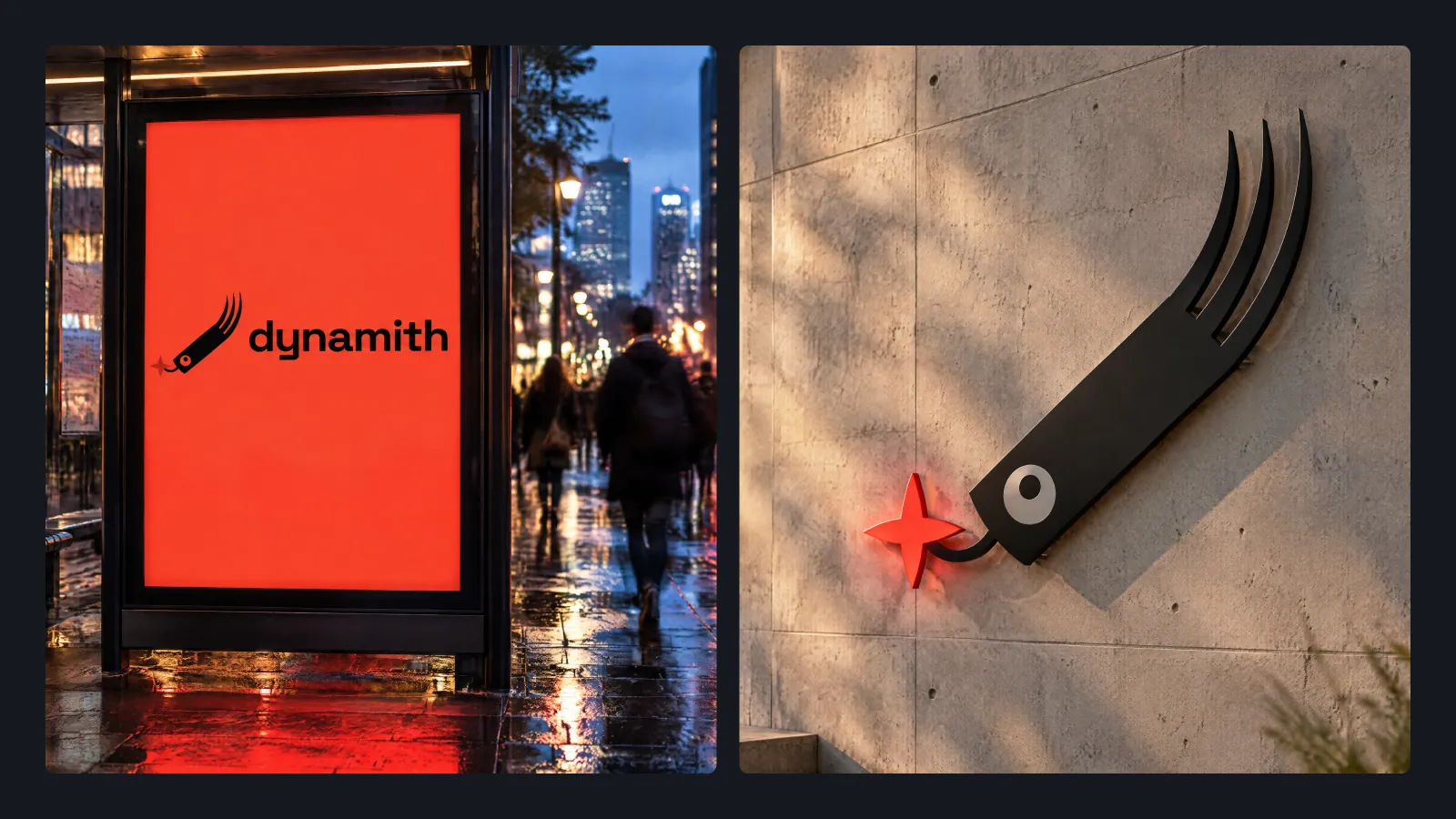
Frame 10 of 30
Out of home
Identity frame
A lit street panel and a cut metal sign on a wall at night. The closing frame answers whether the mark survives at distance and at a glance, which no amount of close-up mockup can tell you.
How we build these →
Frame 11 of 30
The cover
Identity frame
Mark large on near-black, title small underneath, version number below that. A guidelines file gets opened by people who did not commission it, so the first page says which brand and which version before anybody has to ask.
How we build these →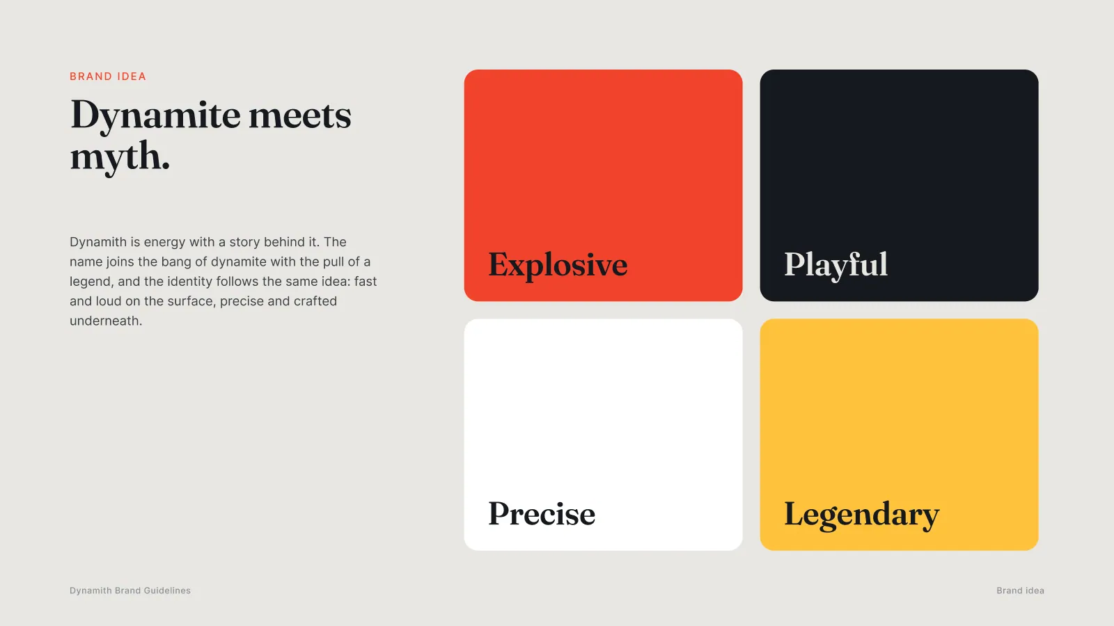
Frame 12 of 30
The brand idea
Identity frame
Dynamite meets myth, with four words in four tiles: explosive, playful, precise, legendary. The tiles are set in the palette rather than describing it, so the page demonstrates the tone on the same spread that names it.
How we build these →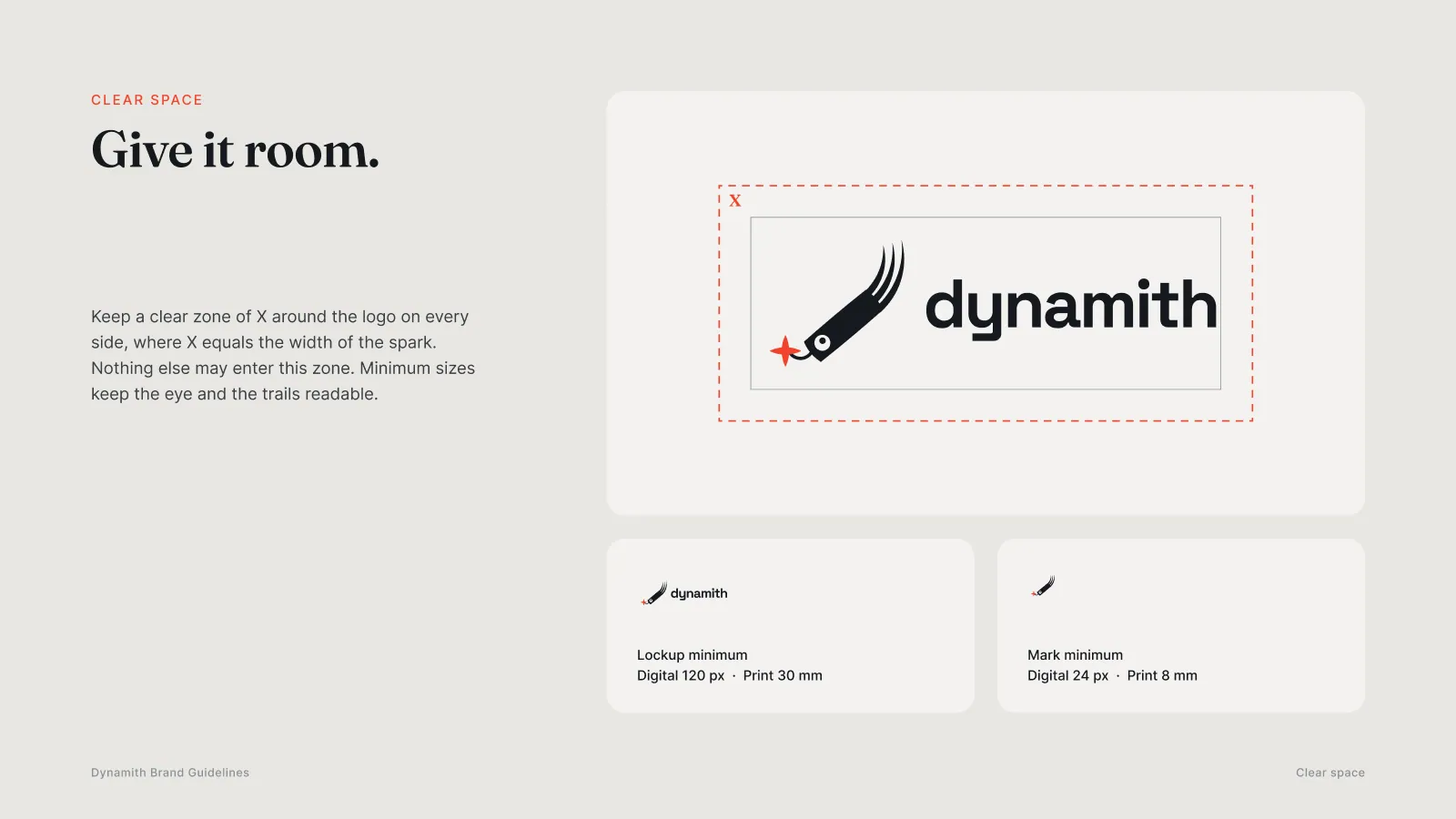
Frame 13 of 30
Clear space and minimum size
Identity frame
The clear zone is defined as X, the width of the spark, so the rule scales with the logo instead of being a fixed measurement that breaks at another size. Minimums are given separately for screen and print, for the lockup and for the mark.
How we build these →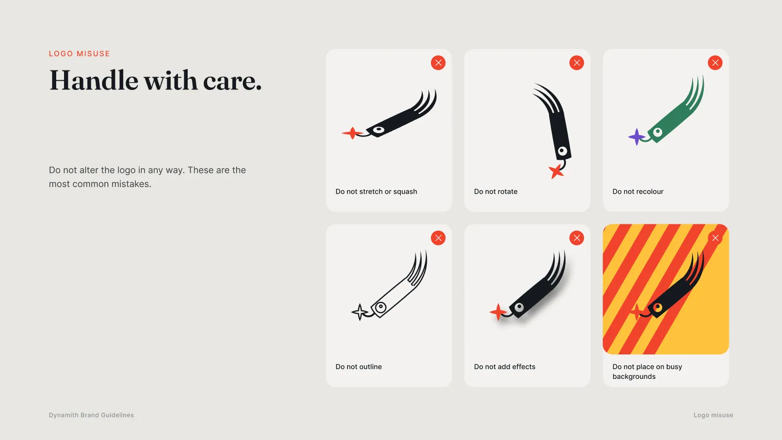
Frame 14 of 30
Logo misuse
Identity frame
Six things not to do, each one shown being done: stretched, rotated, recoloured, outlined, shadowed, and dropped on a busy ground. A misuse page that only describes the mistakes gets ignored; one that shows them is checkable at a glance.
How we build these →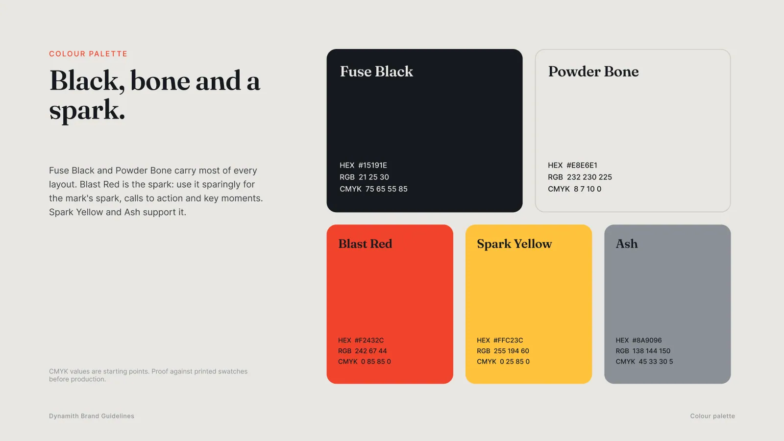
Frame 15 of 30
Colour, with values
Identity frame
Five colours with HEX, RGB and CMYK for each, and a line saying the CMYK figures are starting points to be proofed against printed swatches. Handing a printer a screen colour without that sentence is how a brand ends up with two different reds.
How we build these →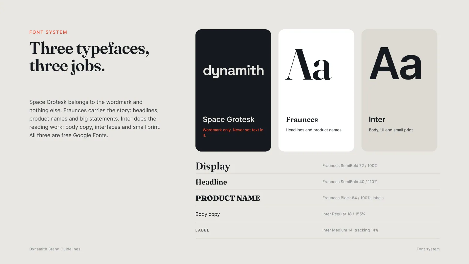
Frame 16 of 30
Three typefaces, three jobs
Identity frame
Space Grotesk belongs to the wordmark and nothing else, Fraunces carries headlines and product names, Inter does the reading. The scale underneath gives size and leading for every level, so the system can be rebuilt by somebody who was not in the room.
How we build these →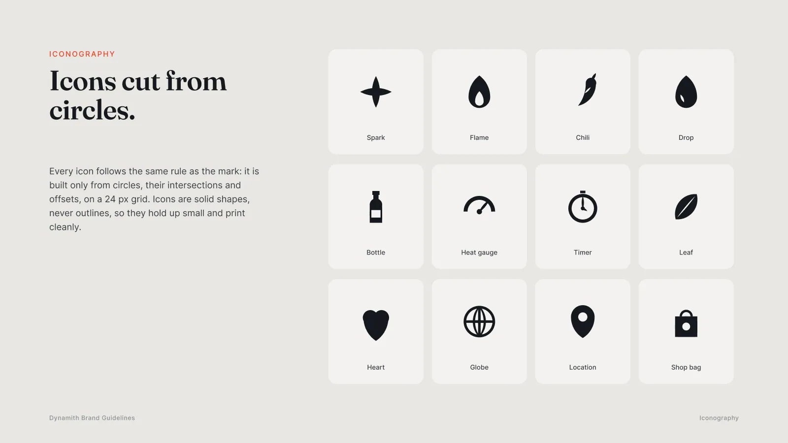
Frame 17 of 30
Iconography
Identity frame
Twelve icons drawn on a 24 px grid from circles only, which is the rule the logo follows. Solid shapes rather than outlines, so they hold together small and print without filling in.
How we build these →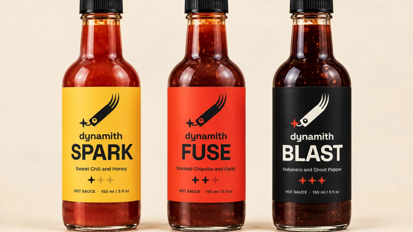
Frame 18 of 30
The three sauces
Identity frame
Spark, Fuse and Blast photographed together. The label colour carries the heat level, so the range reads as one family and as three separate choices in the same glance.
How we build these →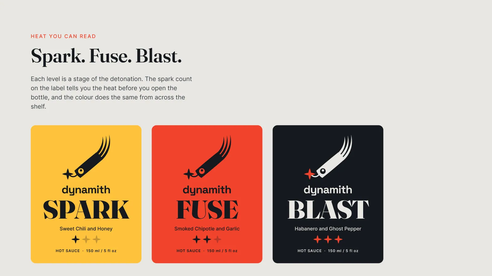
Frame 19 of 30
A heat system, not three labels
Identity frame
Each level named on its own ground with a spark count beside it. The sparks tell you the heat before the bottle is opened and the colour does the same job from across a shelf, which is the whole argument for designing the three together.
How we build these →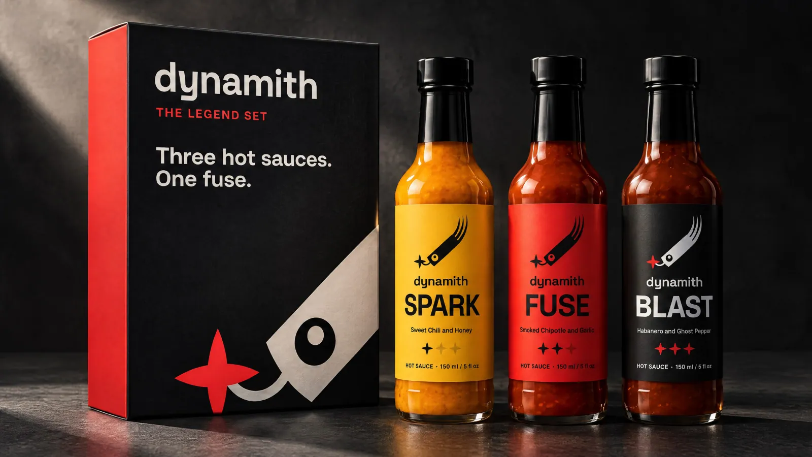
Frame 20 of 30
The Legend Set
Identity frame
All three bottles and the box they ship in. The box carries the mark cropped large off its own edge, which is the supergraphic device the guidelines define two chapters earlier rather than a one-off decision made here.
How we build these →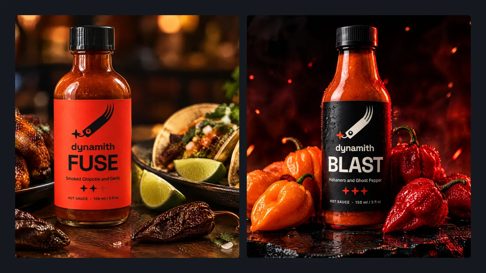
Frame 21 of 30
On a table, not on white
Identity frame
Two moments instead of a studio shot: Fuse beside the food it is for, Blast with the peppers that are in it. Packaging photographed only on white never answers the question of what it is for.
How we build these →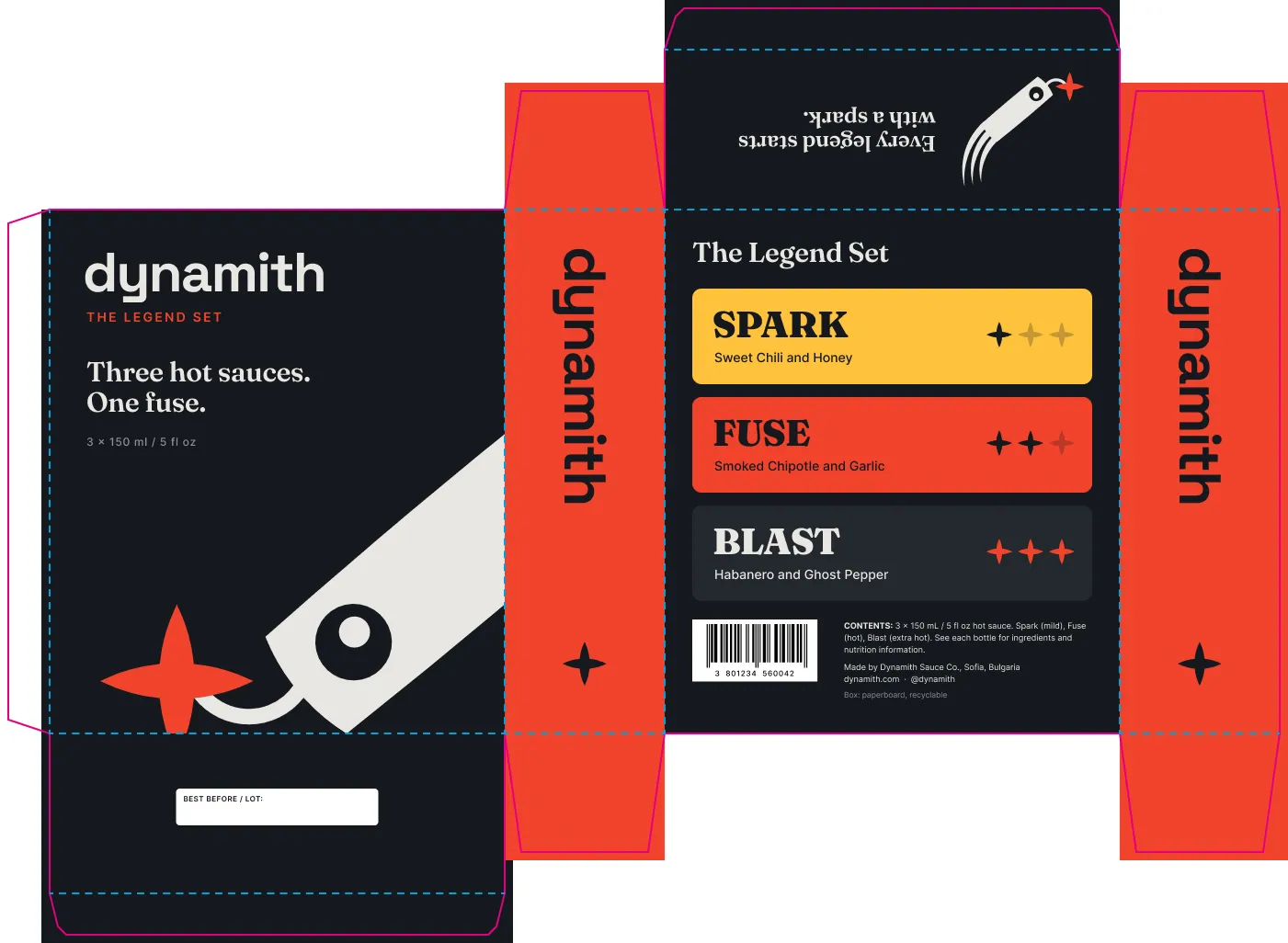
Frame 22 of 30
The dieline
Identity frame
The gift box flattened, cut and fold marked in two colours, artwork running past the cut edge for bleed. This is the file the converter prints from, and it is the reason the box in the previous frame folds up with the mark where it is meant to be.
How we build these →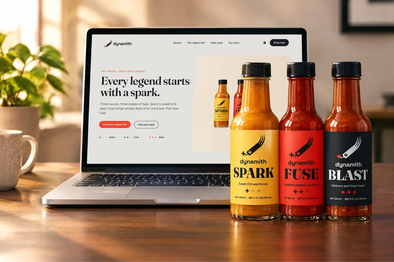
Frame 23 of 30
The site, on a desk
Identity frame
The homepage on a laptop with the bottles beside it. An identity that has only ever been tested in print has not been tested on the screen where most of it gets seen.
How we build these →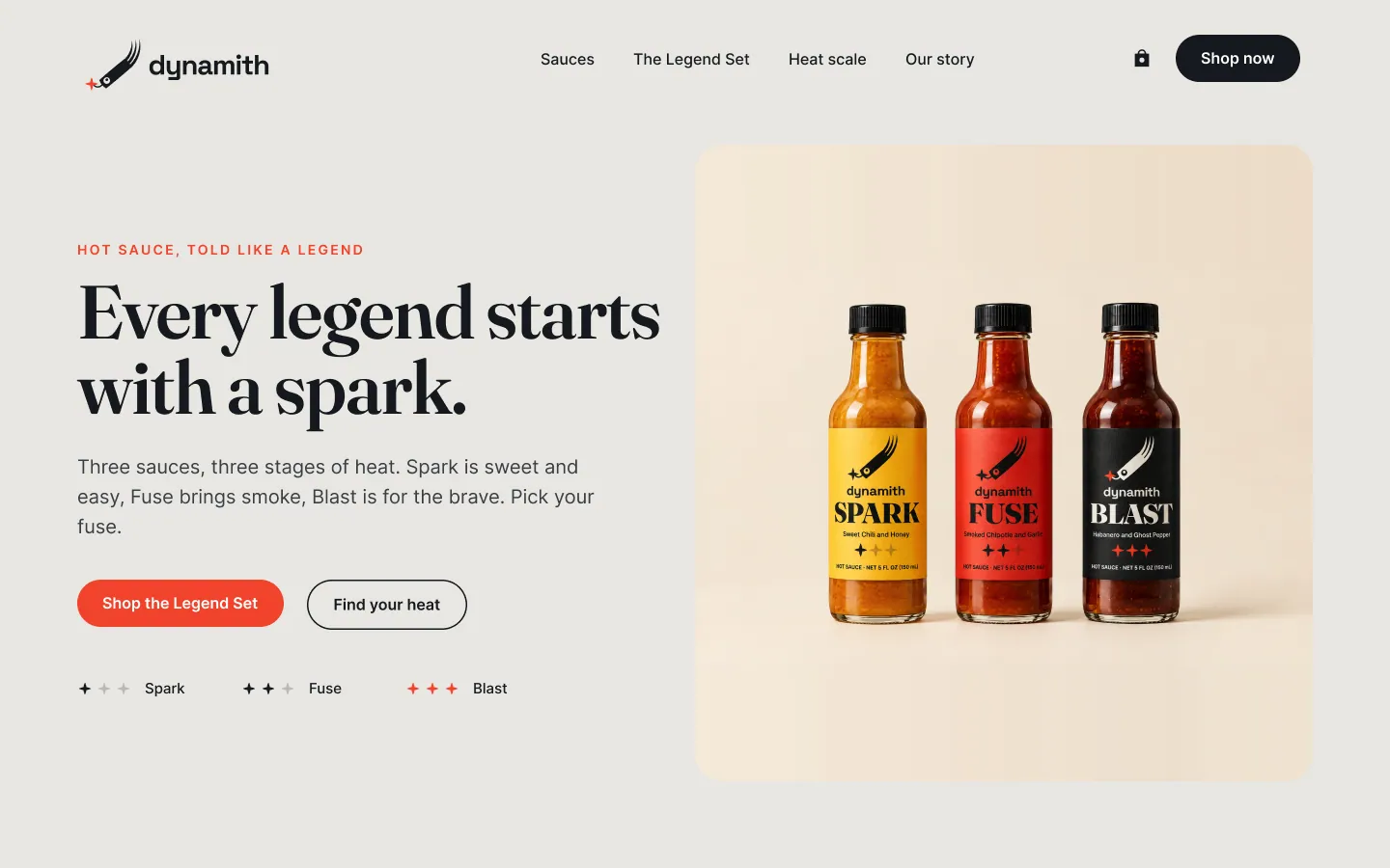
Frame 24 of 30
Homepage hero
Identity frame
Headline in Fraunces, the bottles in frame, and the heat scale sitting under the buttons as three spark counts. The same spark that marks heat on the label is doing navigation here, which is what makes it a system rather than an ornament.
How we build these →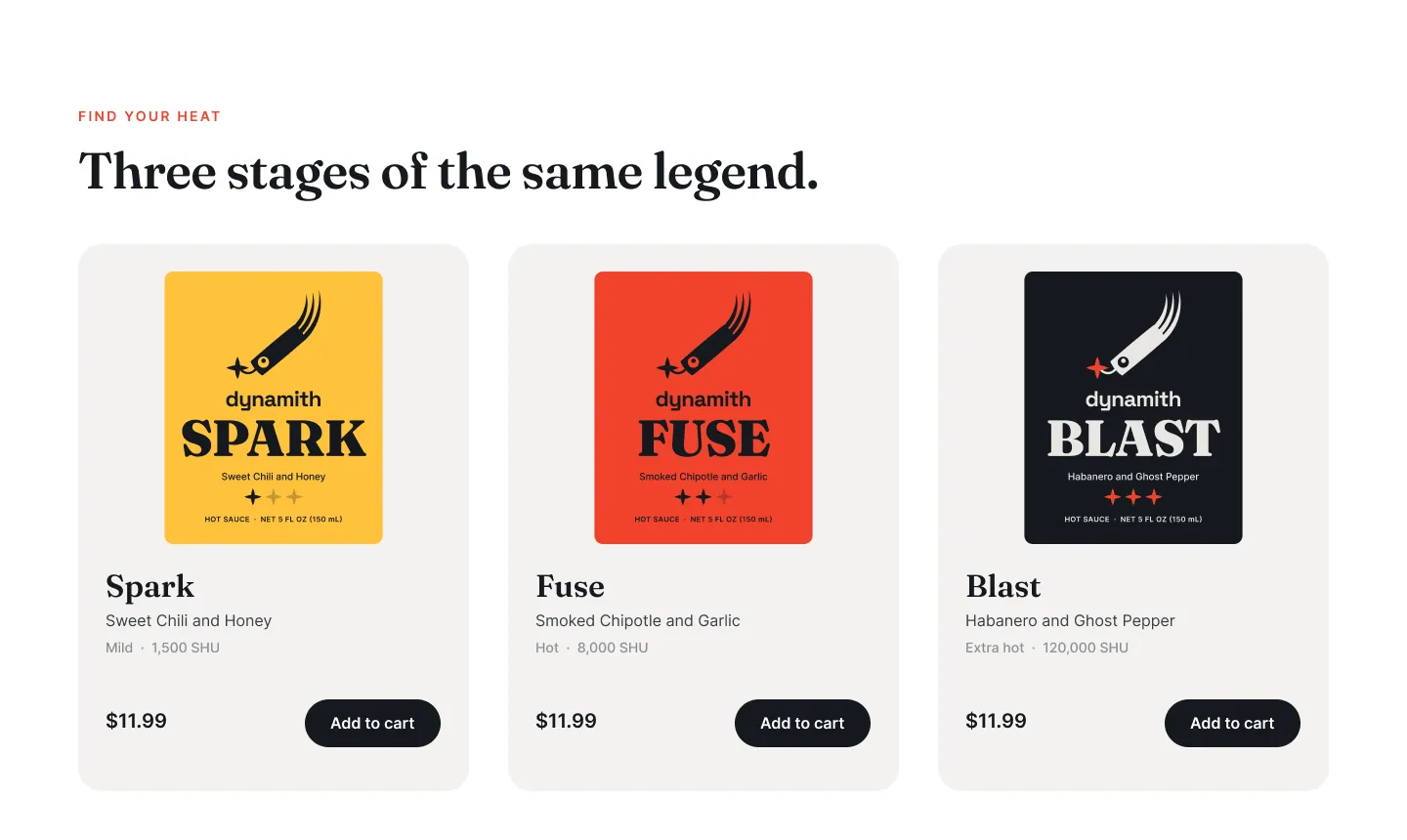
Frame 25 of 30
Find your heat
Identity frame
Three cards, one per sauce, each showing the label itself rather than a photograph of the bottle. The label is the strongest thing this brand owns, so the shop page leads with it.
How we build these →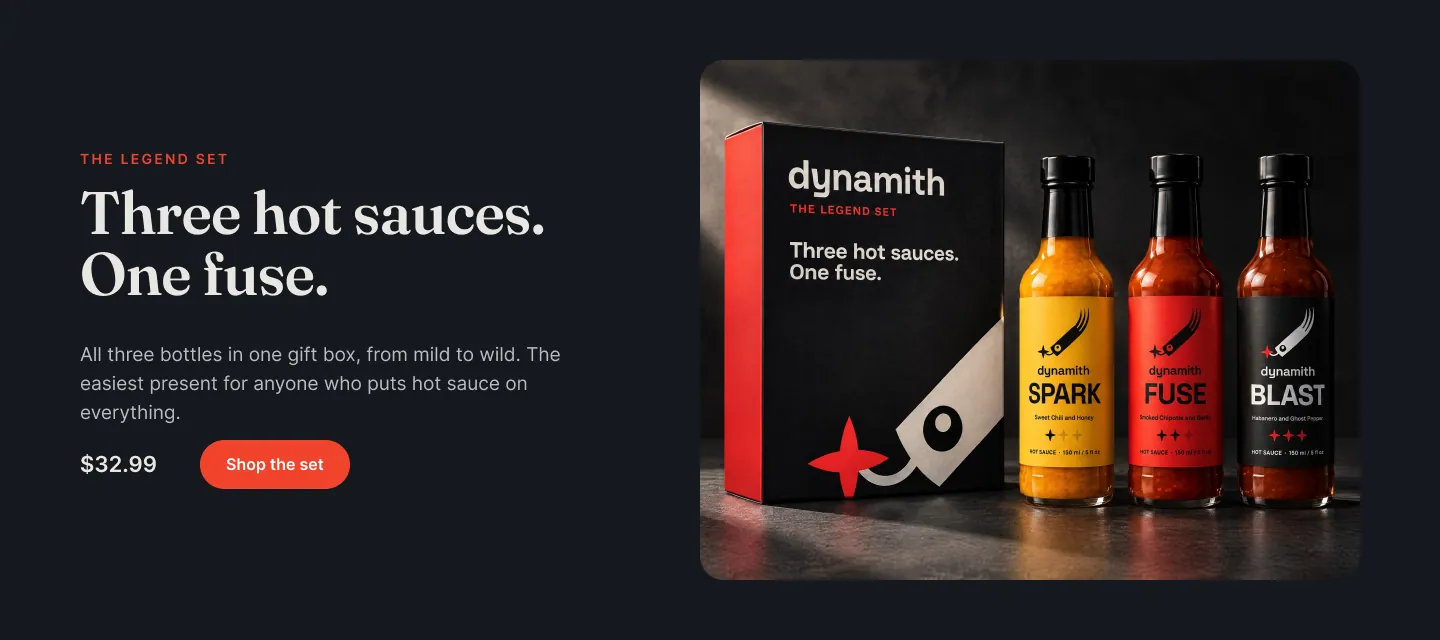
Frame 26 of 30
The set, on the page
Identity frame
The box, the price and a single button in their own band. The set is the easiest thing to buy as a present, so it gets a section of its own instead of becoming a fourth product card nobody reads.
How we build these →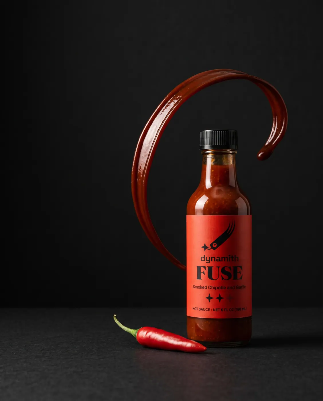
Frame 27 of 30
Fuse
Identity frame
The bottle against black with a ribbon of sauce in the air and a chilli at its base. One product, one gesture, no headline: the label carries the name because the label was built to.
How we build these →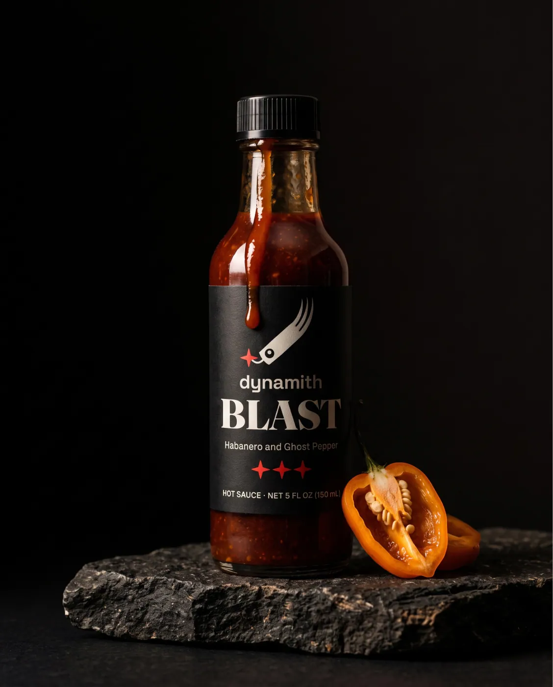
Frame 28 of 30
Blast
Identity frame
The hottest of the three on a dark slab with habanero beside it. The red spark is the only bright thing in the frame, which is exactly the role the guidelines give that colour.
How we build these →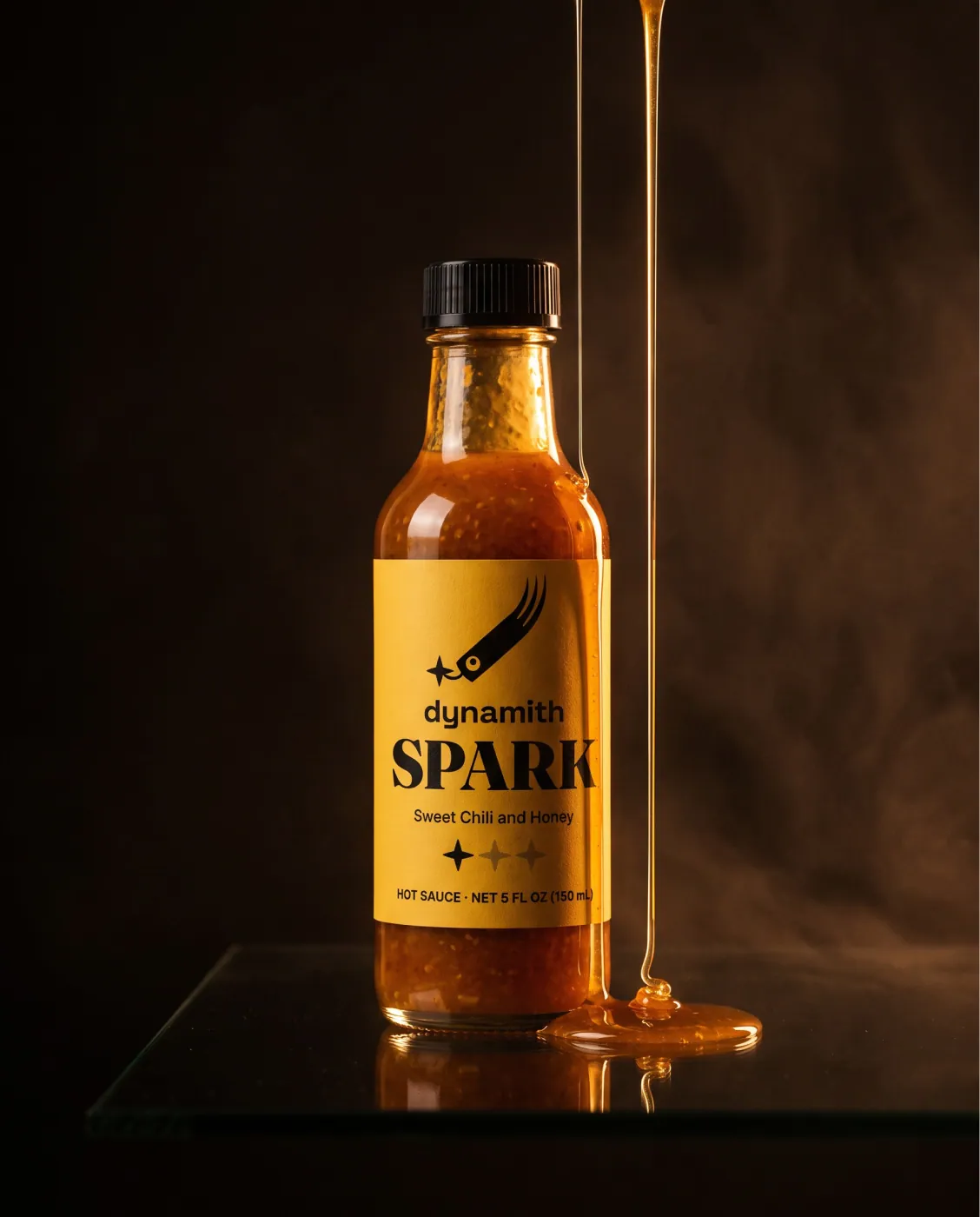
Frame 29 of 30
Spark
Identity frame
Honey pouring past the mildest bottle in warm light, the yellow label doing the work. Each ad takes its colour from its own product rather than from one campaign palette laid over all three.
How we build these →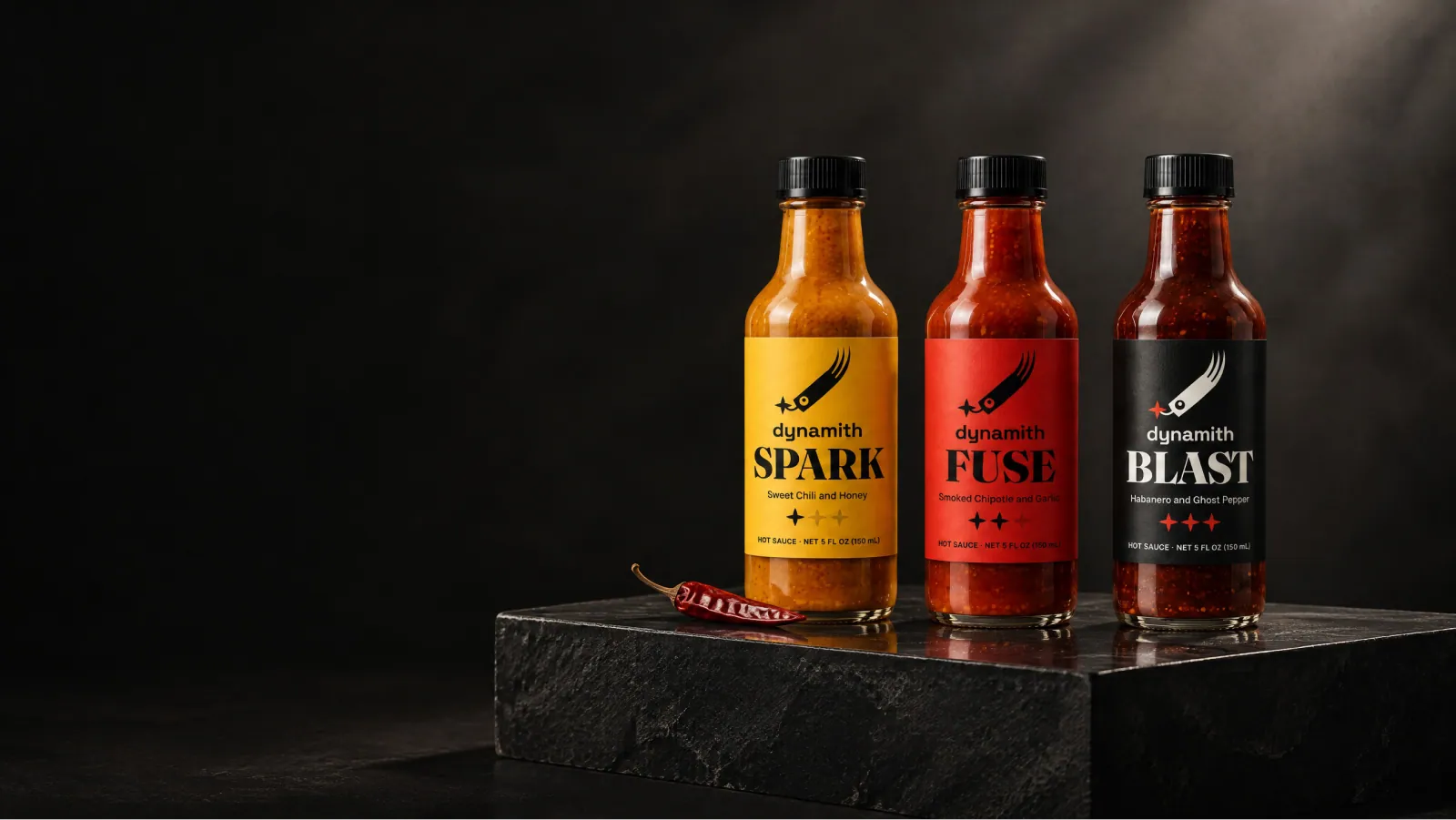
Frame 30 of 30
The wide banner
Identity frame
All three on a plinth for a wide placement. The crop is composed for this shape rather than cut down from the portrait frames, because a letterboxed poster is how a campaign starts to look cheap.
How we build these →